Hypothesis testing
Materials for class on Thursday, November 15, 2018
Contents
Slides
Download the slides from today’s lecture:

Live code
Use this link to see the code that I’m actually typing:
I’ve saved the R script to Dropbox, and that link goes to a live version of that file. Refresh or re-open the link as needed to copy/paste code I type up on the screen.
Hypothesis testing
The magic of ModernDive’s approach to hypothesis testing is that you don’t have to memorize complicated flowcharts to determine if you should run specific statistical tests to test your hypotheses. By using the power of simulation, there is only really one type of statistical hypothesis test, which is essentially this process:
- Calculate δ, or the sample statistic. This is the average, or the median, or the difference in medians, or the proportion of something, or the difference in proportions, etc. This is the thing you care about—you’re testing to see if this number is significant (i.e. if the difference between two means is greater than zero, or if the median value is greater than some other number, etc.)
- Use simulation to invent a world where δ is null. Simulate what the world would look like if there was no difference between two groups, or no difference between proportions, or where the average value is some specific number. This is done with bootstrapping or permutations or some other system of randomly shuffling around your existing data.
- Look at δ in the null world. Put the sample statistic in this null world and see if it fits well.
- Calculate the probability that δ could exist in the null world. This is a p-value, which measures the probability that you’d see δ in a world where there’s no effect or no difference in means.
- Decide if δ is significant. Choose an evidentiary standard to decide if there’s sufficient proof for rejecting the null world (i.e. see if you can convict the effect of being guilty). Standard thresholds are p-values of 0.1, 0.05, and 0.01.
And that’s it! You can repeat this same process for any hypothesis and any δ and reject (or fail to reject) null hypotheses.
Here are a bunch of examples. The more you walk through this process, the more natural and intuitive it will become, and the more you’ll actually understand what a p-value is (so you won’t have a blank stare like these fine scientists).
Load libraries and data
Before the examples, we’ll load our packages and data. You can (and should) follow along by downloading these datasets, putting them in a data folder in an RStudio project, and copying/pasting the code.
library(tidyverse)
library(infer)

set.seed(1234)  # Make these random numbers consistent
sat_gpa <- read_csv("data/sat_gpa.csv")
happiness <- read_csv("data/world_happiness.csv")
gss <- read_csv("data/gss2016.csv")Before we do any testing, we’ll make some subsets of our data
# Rich and poor countries only
high_low_income <- happiness %>%
  filter(income %in% c("High income", "Low income"))

# Medium rich and medium poor countries only
middle_income <- happiness %>%
  filter(income %in% c("Upper middle income", "Lower middle income"))
Difference in means (easy visual test)
Sometimes you can skip the whole hypothesis testing process if the thing you’re testing is super obvious. For instance, we want to know if the average level of national happiness is greater in rich countries than in poor countries.
First, let’s calculate the difference in average happiness in rich and poor countries. We can do this a couple ways. We can use group_by() and summarize() to see the average happiness scores:
high_low_income %>%
  group_by(income) %>%
  summarize(avg_happiness = mean(happiness_score, na.rm = TRUE))
## # A tibble: 2 x 2
## income avg_happiness
## <chr> <dbl>
## 1 High income 6.48
## 2 Low income 4.00The average score in rich countries is 6.5 and the average score in poor countries is 4. That’s a difference of roughly 2.5, which seems pretty big.
We can also get the actual difference in means by using specify() and calculate(). We specify the order here so that we run \(\bar{x}_{\text{High income}} - \bar{x}_{\text{Low income}}\).
rich_poor_happiness_diff <- high_low_income %>%
  specify(formula = happiness_score ~ income) %>%
  calculate(stat = "diff in means", order = c("High income", "Low income"))
rich_poor_happiness_diff
## # A tibble: 1 x 1
## stat
## <dbl>
## 1 2.49The difference is 2.49 points.
Is that difference real though? Could it potentially be 0?
Let’s look at it first. Here’s a boxplot showing the average happiness in both types of countries
ggplot(high_low_income, aes(x = income, y = happiness_score)) +
  geom_boxplot()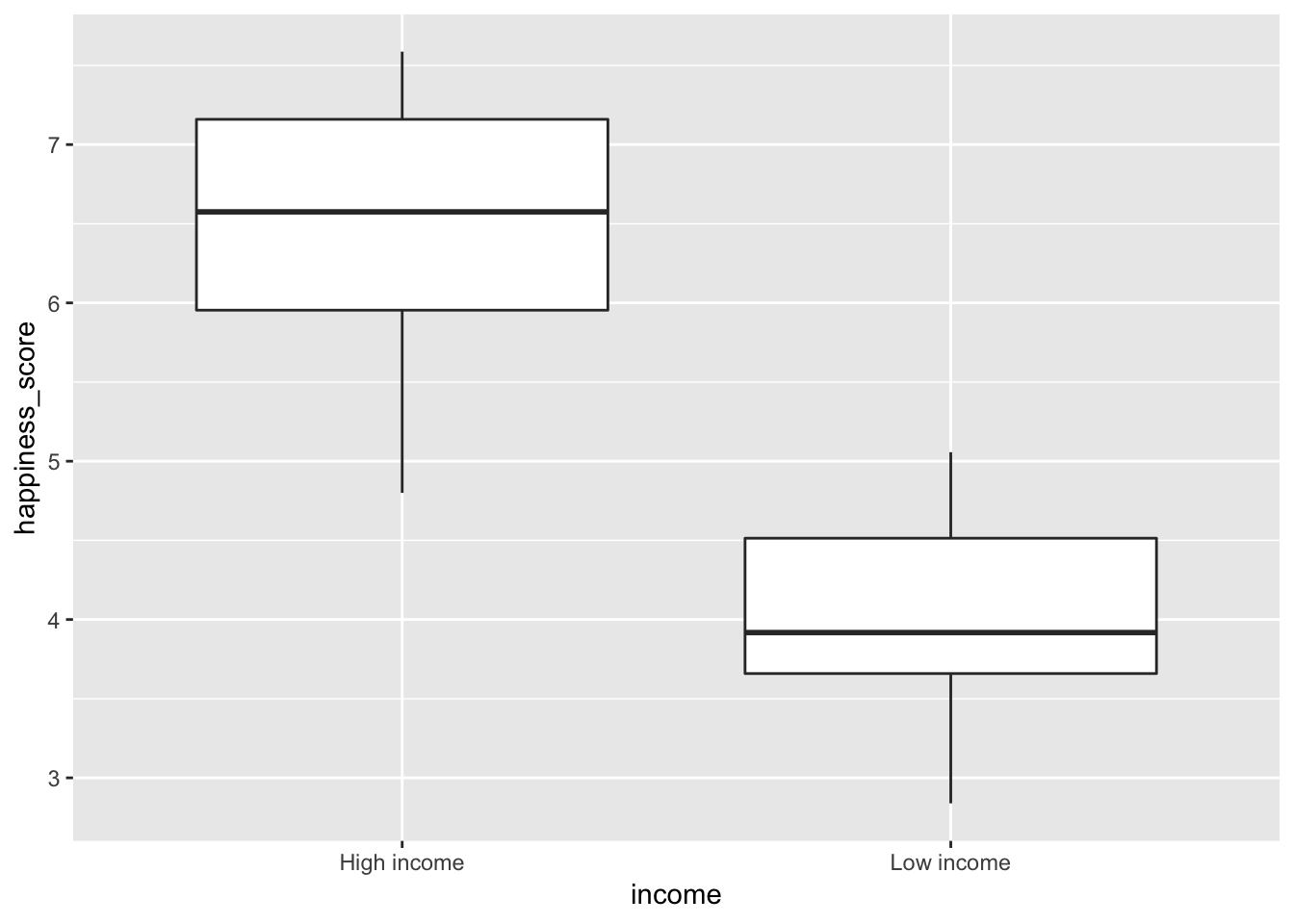
There’s a huge difference. There’s pretty much zero chance these two things overlap. We can end our hypothesis testing here, since we have substantial evidence to convict and reject the null hypothesis that there’s no effect.
Difference in means (I)
Next, let’s look at the difference in happiness is middle income countries. First, we’ll plot it to see if we can get out of more rigorous testing:
ggplot(middle_income, aes(x = income, y = happiness_score)) +
  geom_boxplot()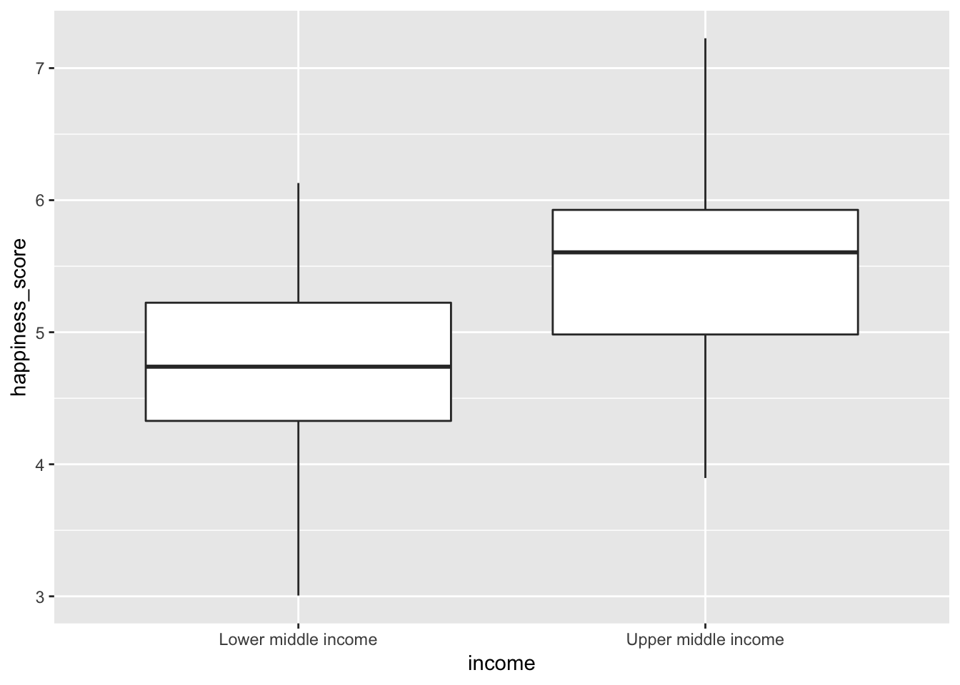
Here we see that upper middle income countries do have a higher average happiness score, than their lower middle income counterparts, but there’s some overlap. Some lower middle income countries are happier than upper middle income countries and vice versa. We’ll need to see if the difference between the two groups is really real. Time for simulation-based hypothesis testing!
Step 1: Calculate δ. Our δ here is the difference in mean happiness scores, or \(\bar{x}_{\text{Upper middle income}} - \bar{x}_{\text{Lower middle income}}\).
middle_happiness_diff <- middle_income %>%
  specify(formula = happiness_score ~ income) %>%
  calculate(stat = "diff in means", order = c("Upper middle income", "Lower middle income"))
middle_happiness_diff
## # A tibble: 1 x 1
## stat
## <dbl>
## 1 0.783Our δ is 0.78 happiness points. On average, upper middle income countries are 0.78 points happier than their lower middle income counterparts. But is that difference real? Could it maybe be zero?
Step 2: Invent world where δ is null. We can use simulation to generate a world where the actual difference between these two types of countries is zero.
happiness_diff_in_null_world <- middle_income %>%
  specify(happiness_score ~ income) %>%
  hypothesize(null = "independence") %>%
  generate(reps = 5000) %>%
  calculate(stat = "diff in means", order = c("Upper middle income", "Lower middle income"))
## Setting `type = "permute"` in `generate()`.happiness_diff_in_null_world %>% visualize()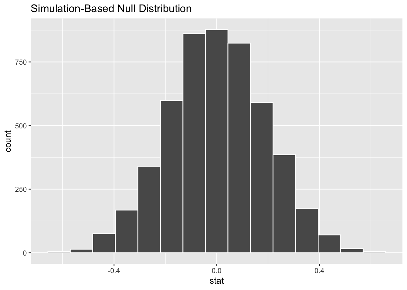
According to this, in a world where there’s no actual difference, we’d mostly see a 0 point difference. Because of random chance, we could see a difference as low as -0.4 or as high as 0.4 points, but that’s not anything special or significant. If we saw a difference of 0.4 in our data, that could be just like seeing 6 heads in a row when flipping a coin—routine.
Step 3: Look at δ in the null world. Next, we put our sample statistic δ in this histogram and see if it looks out of place.
happiness_diff_in_null_world %>%
  visualize(obs_stat = middle_happiness_diff)
## Warning: `visualize()` shouldn't be used to plot p-value. Arguments
## `obs_stat`, `obs_stat_color`, `pvalue_fill`, and `direction` are
## deprecated. Use `shade_p_value()` instead.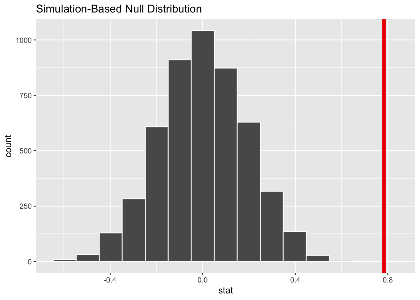
Our sample difference of 0.78 would be pretty abnormal if there really was no difference. That’s a good sign of strong evidence in favor of rejecting the null and “convicting” the effect of being “guilty” (or really not zero).
Step 4: Calculate probability. We can quantify this evidence with a p-value. What is the chance that we’d see that red line in the world where there’s no difference? (Note that we use direction = "both; for now, always do that. We’ll talk about why in a future class.)
happiness_diff_in_null_world %>%
  get_pvalue(obs_stat = middle_happiness_diff, direction = "both")
## # A tibble: 1 x 1
## p_value
## <dbl>
## 1 0The probability we’d see that red line in a world where there’s no difference is 0. Technically isn’t not quite 0—it’s something like 0.00001, but 0 is good enough for our purposes. This means there’s pretty much no chance that we’d see a difference of 0.78 in a world of “innocence,” or in a world where there’s no difference.
Step 5: Decide if δ is significant. If we use a regular standard of 0.05 (the probability that we make a Type I error, or make a false positive, or lock up an innocent person), we’ve definitely met that standard. 0 is less than 0.05.
Final step: Write this up. Here’s what we can say about this hypothesis test in a report:
On average, upper middle income countries score 0.78 points higher in national happiness than lower middle income countries. This difference is statistically significant (p < 0.001).
Note how I don’t say “p = 0”. That’s because it’s not. When you deal with tiny tiny p-values like this, it’s normal to just say that it’s less than 0.001.
Difference in means (II)
Now we can look at the difference in school enrollment in the two types of middle income countries. I’ll be less verbose about the process here.
Here are our hypotheses:
- H0: \(\mu_{\text{Upper middle income}} - \mu_{\text{Lower middle income}} = 0\)
- HA: \(\mu_{\text{Upper middle income}} - \mu_{\text{Lower middle income}} \neq 0\)
We want to gather enough evidence to reject the null hypothesis and prove “guilt” (the alternative hypothesis) that the population-level difference between these two groups is not 0.
Step 0: Visualize to see if we can skip this testing. If we look at average school enrollment in the two types of countries, we see that upper middle income countries appear to have a higher average, but there’s a lot of overlap with lower middle income countries, so we can’t immediately assume this is a real difference.
ggplot(middle_income, aes(x = income, y = school_enrollment)) +
  geom_boxplot()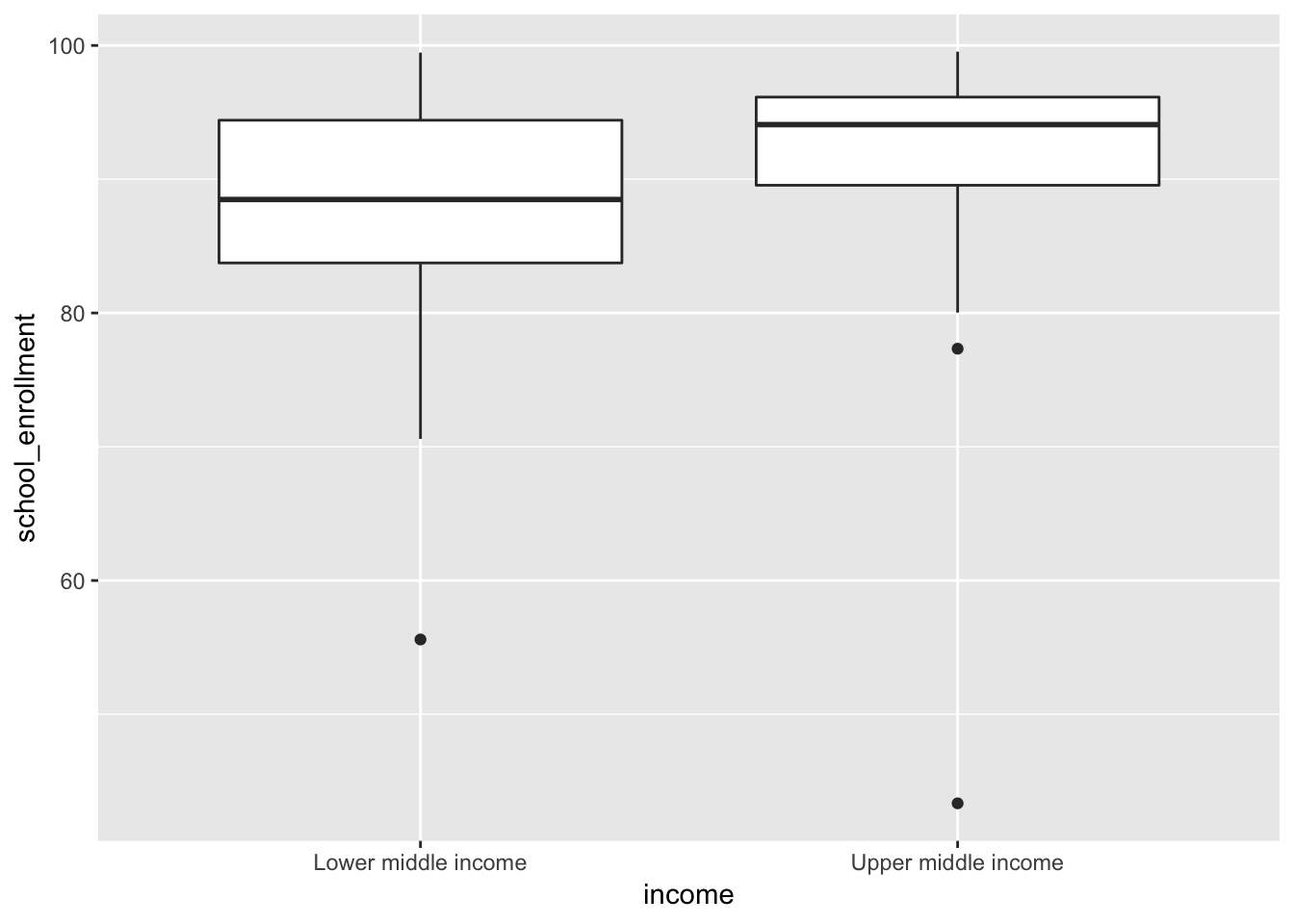
Step 1: Calculate δ. Our δ here is the difference in mean school enrollment, or \(\bar{x}_{\text{Upper middle income}} - \bar{x}_{\text{Lower middle income}}\).
middle_school_diff <- middle_income %>%
  specify(formula = school_enrollment ~ income) %>%
  calculate(stat = "diff in means", order = c("Upper middle income", "Lower middle income"))
middle_school_diff
## # A tibble: 1 x 1
## stat
## <dbl>
## 1 4.29Our δ is 4.29% enrollment (this variable is measured in percent; a country with a score of 90 would have 90% of its kids enrolled in school). On average, upper middle income countries have more kids in school than their lower middle income counterparts. But is that difference real? Could it maybe be zero?
Step 2: Invent world where δ is null. We use simulation to generate a world where the actual difference between these two types of countries is zero.
school_diff_in_null_world <- middle_income %>%
  specify(school_enrollment ~ income) %>%
  hypothesize(null = "independence") %>%
  generate(reps = 5000) %>%
  calculate(stat = "diff in means", order = c("Upper middle income", "Lower middle income"))
## Setting `type = "permute"` in `generate()`.school_diff_in_null_world %>% visualize()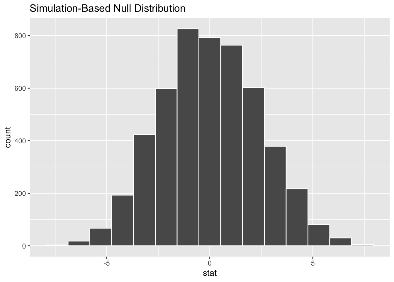
According to this, in a world where there’s no actual difference, we’d mostly see a 0% difference. Because of random chance, we could see a difference as low as -5% or as high as 5%. (i.e. if one country has 99% enrollment and another has 95% enrollment, that’s not anything special—that 3% difference could just be random chance)
Step 3: Look at δ in the null world. Next, we put our sample statistic δ in this histogram and see if it looks out of place.
school_diff_in_null_world %>%
  visualize(obs_stat = middle_school_diff)
## Warning: `visualize()` shouldn't be used to plot p-value. Arguments
## `obs_stat`, `obs_stat_color`, `pvalue_fill`, and `direction` are
## deprecated. Use `shade_p_value()` instead.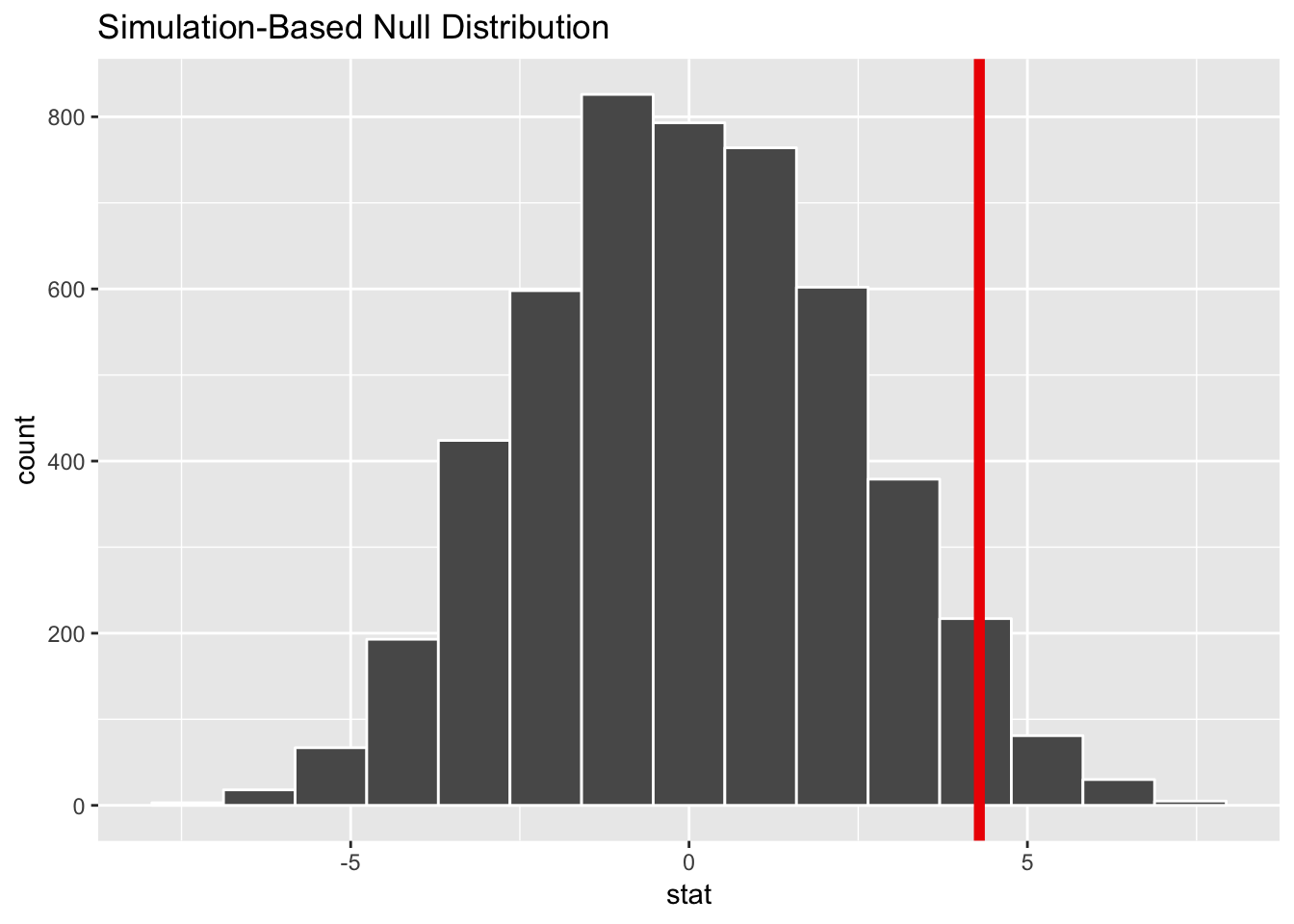
Our sample difference of 4.3% is kind of large for a world of no difference, but it’s not exceptionally abnormal. It’s plausible to see that kind of difference just by random chance.
Step 4: Calculate probability. What is the chance that we’d see that red line in the world where there’s no difference?
diff_school_pvalue <- school_diff_in_null_world %>%
  get_pvalue(obs_stat = middle_school_diff, direction = "both")
diff_school_pvalue
## # A tibble: 1 x 1
## p_value
## <dbl>
## 1 0.0732The probability we’d see that red line in a world where there’s no difference is 0.0732.
Step 5: Decide if δ is significant. If we use a regular standard of 0.05, we actually don’t have enough evidence to “convict”, since the p-value is 0.0732.
Final step: Write this up. Here’s what we can say about this hypothesis test in a report:
On average, upper middle income countries have 4.3% higher school enrollment than lower middle income countries, but this difference is not statistically significant (p = 0.07).
Difference in means (III)
In problem set 4, you used regression to explore the relationship between SAT scores and college GPA by sex. Interestingly, you found that women score lower on the SAT but have higher freshman GPAs than men. Let’s see if that difference is real.
Our null hypothesis is that there’s no difference in freshman GPA between the sexes; our alternative hypothesis is that there is a difference. Here’s the mathy version of these hypotheses:
- H0: \(\mu_{\text{Male}} - \mu_{\text{Female}} = 0\)
- HA: \(\mu_{\text{Male}} - \mu_{\text{Female}} \neq 0\)
We want to gather enough evidence to reject the null hypothesis and prove “guilt” (the alternative hypothesis) that the population-level difference between these two groups is not 0.
Step 0: Visualize to see if we can skip this testing. Let’s look at a graph to see if we can “convict” immediately with visual evidence. We can’t; these overlap too much. Women have a higher average GPA, but it’s impossible to tell if it’s different just with a graph.
ggplot(sat_gpa, aes(x = sex, y = gpa_fy)) +
  geom_boxplot()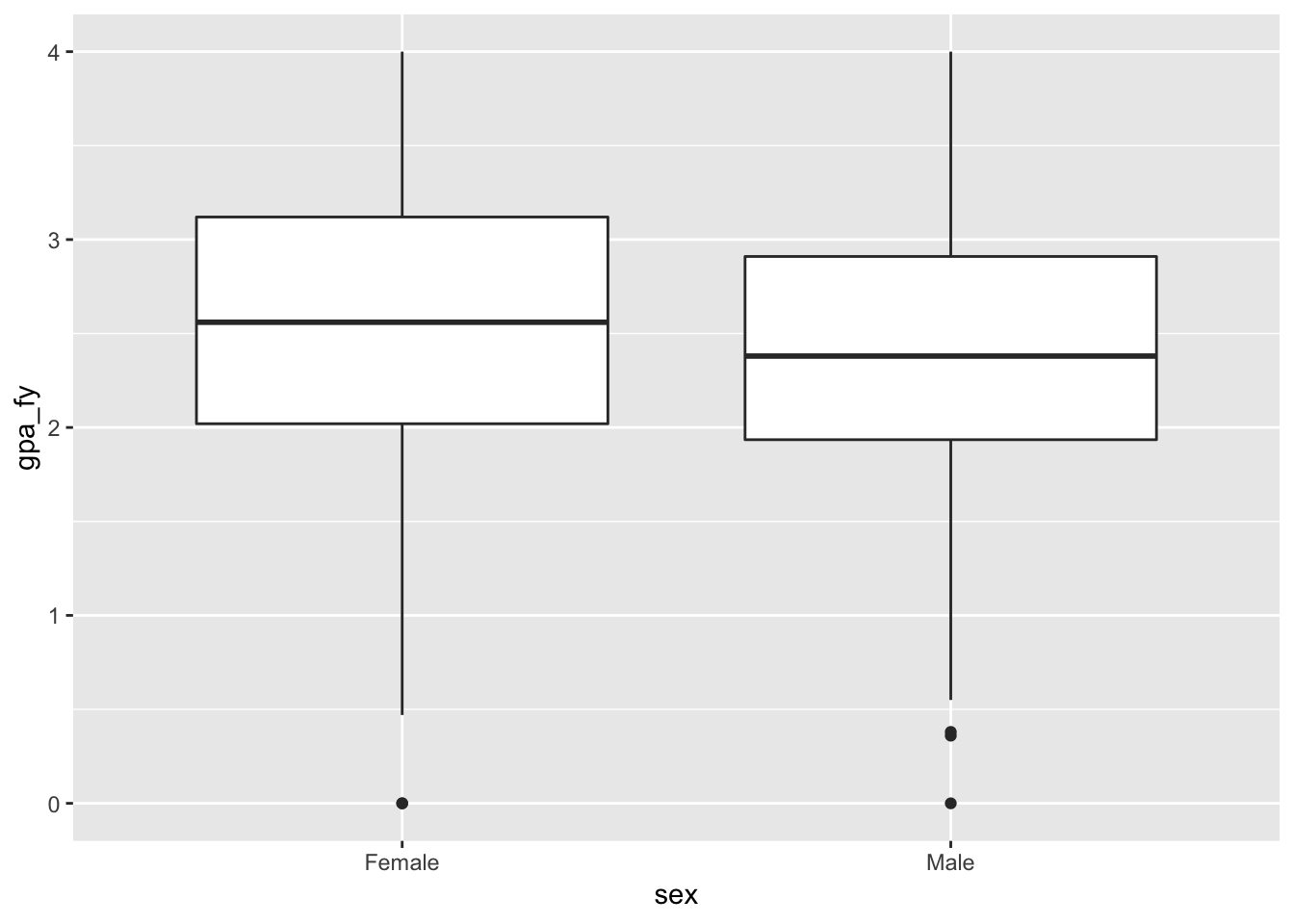
Step 1: Calculate δ. Our δ here is the difference in freshman GPA, or \(\bar{x}_{\text{Male}} - \bar{x}_{\text{Female}}\).
gpa_diff <- sat_gpa %>%
  specify(formula = gpa_fy ~ sex) %>%
  calculate(stat = "diff in means", order = c("Male", "Female"))
gpa_diff
## # A tibble: 1 x 1
## stat
## <dbl>
## 1 -0.149Our δ is -0.15. On average, men have have a 0.15 point lower GPA than women. But is that difference real? Could it maybe be zero?
Step 2: Invent world where δ is null. We use simulation to generate a world where the actual difference between these two groups is zero.
gpa_diff_in_null_world <- sat_gpa %>%
  specify(formula = gpa_fy ~ sex) %>%
  hypothesize(null = "independence") %>%
  generate(reps = 5000) %>%
  calculate(stat = "diff in means", order = c("Male", "Female"))
## Setting `type = "permute"` in `generate()`.gpa_diff_in_null_world %>% visualize()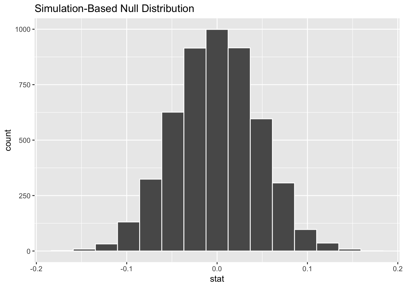
According to this, in a world where there’s no actual difference, we’d mostly see a 0 point difference. Because of random chance, we could see a difference as low as -0.1 or as high as 0.1. (i.e. if one student has a GPA of 3.5 and another has a 3.55, that’s not anything special—that 0.05 difference could just be random chance)
Step 3: Look at δ in the null world. Next, we put our sample statistic δ in this histogram and see if it looks out of place.
gpa_diff_in_null_world %>%
  visualize(obs_stat = gpa_diff)
## Warning: `visualize()` shouldn't be used to plot p-value. Arguments
## `obs_stat`, `obs_stat_color`, `pvalue_fill`, and `direction` are
## deprecated. Use `shade_p_value()` instead.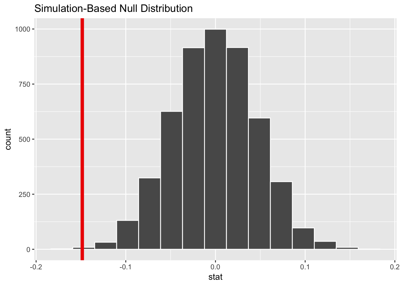
Our sample difference of -0.15 seems small and rare for a world of no difference.
Step 4: Calculate probability. What is the chance that we’d see that red line in the world where there’s no difference?
diff_gpa_pvalue <- gpa_diff_in_null_world %>%
  get_pvalue(obs_stat = gpa_diff, direction = "both")
diff_gpa_pvalue
## # A tibble: 1 x 1
## p_value
## <dbl>
## 1 0.002The probability we’d see that red line in a world where there’s no difference is 0.002.
Step 5: Decide if δ is significant. If we use a regular standard of 0.05, we have enough evidence to “convict”, since the p-value is 0.002. We could even use a standard of 0.01 and still have evidence beyond reasonable doubt. The difference is most likely real (or guilty)
Final step: Write this up. Here’s what we can say about this hypothesis test in a report:
On average, men have a 0.15 point lower freshman GPA than women, and this difference is statistically significant (p = 0.002).
Difference in proportions (I)
In problem set 5, you used data from the 2016 GSS to estimate the proportion of people in the US who have faced harassment at work. Let’s extend that a little to see if people not born in the US face more harassment than those who are born in the US.This is an actual research question; see Under cover of darkness, female janitors face rape and assault, for instance, where non-citizens are scared to report issues of sexual harassment and are more likely to work in places where they can be taken advantage of.
Our null hypothesis is that there’s no difference in the proportion of people who have faced harassment; our alternative hypothesis is that there is a difference. Here’s the mathy version of these hypotheses (note that this \(p\) is different from the p-value \(p\); this \(p\) stands for the population proportion parameter, like \(\mu\), but for proportions):
- H0: \(p_{\text{Not born in US}} - p_{\text{Born in US}} = 0\)
- HA: \(p_{\text{Not born in US}} - p_{\text{Born in US}} \neq 0\)
We want to gather enough evidence to reject the null hypothesis and prove “guilt” (the alternative hypothesis) that the population-level difference between these two groups’ proportions is not 0.
The really cool thing about this is that we don’t need to look at a flowchart to choose the right version of the statistical test that measures differences in proportions. We do the exactly same simulation process as before.
Step 0: Visualize to see if we can skip this testing. Let’s look at a graph to see if we can “convict” immediately with visual evidence. We can’t, though. 18% of those born in the US have faced harassment, compared to 15% of those not born in the US. That’s not a huge giant obvious difference, so we’ll need to simulate.
# Limit GSS data to just yes/no responses to harassment question
gss_harass <- gss %>%
  filter(harass5 %in% c("No", "Yes"))

# Wrangle the data a little to calculate group proportions
plot_prop_harass_born <- gss_harass %>%
  count(born, harass5) %>%
  group_by(born) %>%
  mutate(prop = n / sum(n))
plot_prop_harass_born
## # A tibble: 4 x 4
## # Groups: born [2]
## born harass5 n prop
## <chr> <chr> <int> <dbl>
## 1 No No 145 0.853
## 2 No Yes 25 0.147
## 3 Yes No 991 0.824
## 4 Yes Yes 212 0.176# Make a bar plot of just the yes proportions
ggplot(filter(plot_prop_harass_born, harass5 == "Yes"),
aes(x = born, y = prop, fill = born)) +
geom_col()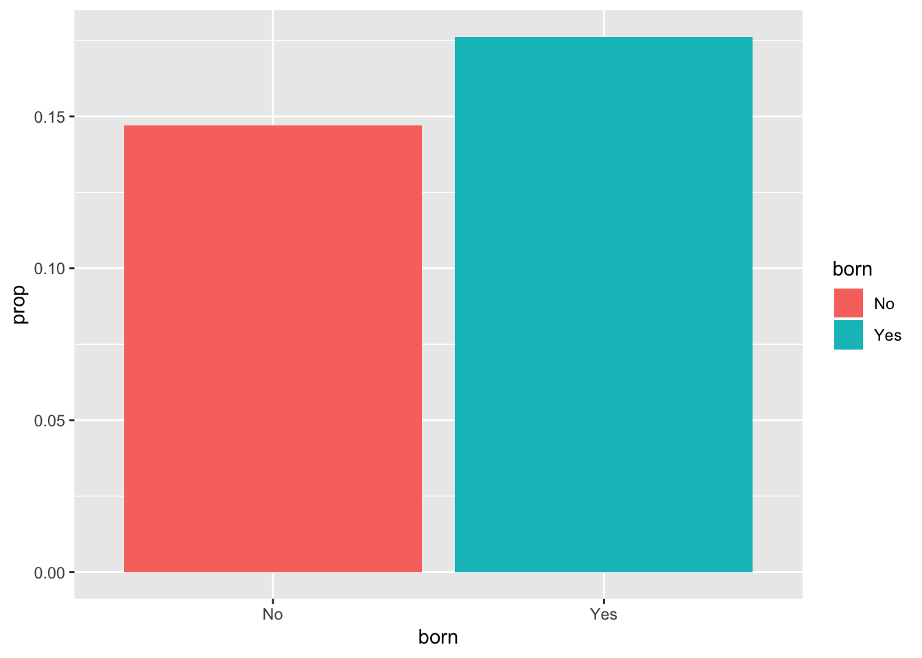
Step 1: Calculate δ. Our δ here is the difference in the proportion of US-born and non-US-born residents who have faced harassment at work, or \(\hat{p}_{\text{Not born in the US}} - \hat{p}_{\text{Born in the US}}\). We have to specify a success value (if we do “yes”, it’ll calculate the proportion of yesses; if we do “no”, it’ll calculate the proportion of nos), and we specify “No” - “Yes” in the order so we subtract those born in the US from those not born in the US.
harass_diff_born <- gss_harass %>%
  specify(formula = harass5 ~ born, success = "Yes") %>%
  calculate(stat = "diff in props", order = c("No", "Yes"))
harass_diff_born
## # A tibble: 1 x 1
## stat
## <dbl>
## 1 -0.0292Our δ is -0.03, which means there’s a 3% difference between the two groups, which we saw in the bar chart above. But is that difference real? Could it maybe be zero?
Step 2: Invent world where δ is null + Step 3: Look at δ in the null world. We use simulation to generate a world where the actual difference between these two groups is zero, and then we put δ there to see if it’s weird or unexpected.
harass_born_diff_in_null_world <- gss_harass %>%
  select(harass5, born) %>%
  specify(formula = harass5 ~ born, success = "Yes") %>%
  hypothesize(null = "independence") %>%
  generate(reps = 5000) %>%
  calculate(stat = "diff in props", order = c("No", "Yes"))
## Setting `type = "permute"` in `generate()`.harass_born_diff_in_null_world %>%
visualize(obs_stat = harass_diff_born)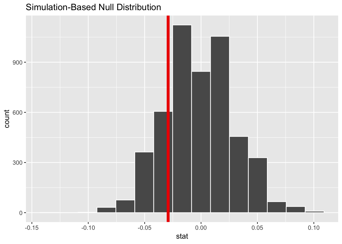
According to this, in a world where there’s no actual difference, we’d mostly see a 0% difference, but because of random chance, we could see a differences of ±5% (or more). Our sample difference of 3% fits fairly well in this fake world where there’s no difference.
Step 4: Calculate probability. What is the chance that we’d see that red line in the world where there’s no difference?
diff_harass_born_pvalue <- harass_born_diff_in_null_world %>%
  get_pvalue(obs_stat = harass_diff_born, direction = "both")
diff_harass_born_pvalue
## # A tibble: 1 x 1
## p_value
## <dbl>
## 1 0.432The probability we’d see that red line in a world where there’s no difference is 0.432.
Step 5: Decide if δ is significant. If we use a regular standard of 0.05, we definitely don’t have enough evidence to “convict”, since the p-value is so high.
Final step: Write this up. Here’s what we can say about this hypothesis test in a report:
There is no significant difference between the proportion of US-born and non-US born workers that have faced harassment in the workplace (δ = 0.03, p = 0.43).
All of that simulation work gets you a single sentence!
Difference in proportions (II)
Now let’s see if women face more harassment at work than men. Our null hypothesis is that there’s no difference in the proportion of people who have faced harassment; our alternative hypothesis is that there is a difference:
- H0: \(p_{\text{Female}} - p_{\text{Male}} = 0\)
- HA: \(p_{\text{Female}} - p_{\text{Male}} \neq 0\)
Step 0: Visualize to see if we can skip this testing. Let’s look at a graph to see if we can “convict” immediately with visual evidence. We can’t, though. 19% of females have faced harassment, compared to 15.5% of males. That’s not a huge giant obvious difference, so we’ll need to simulate.
# Wrangle the data a little to calculate group proportions
plot_prop_harass_sex <- gss_harass %>%
  count(sex, harass5) %>%
  group_by(sex) %>%
  mutate(prop = n / sum(n))
plot_prop_harass_sex
## # A tibble: 4 x 4
## # Groups: sex [2]
## sex harass5 n prop
## <chr> <chr> <int> <dbl>
## 1 Female No 563 0.810
## 2 Female Yes 132 0.190
## 3 Male No 573 0.845
## 4 Male Yes 105 0.155# Make a bar plot of just the yes proportions
ggplot(filter(plot_prop_harass_sex, harass5 == "Yes"),
aes(x = sex, y = prop, fill = sex)) +
geom_col()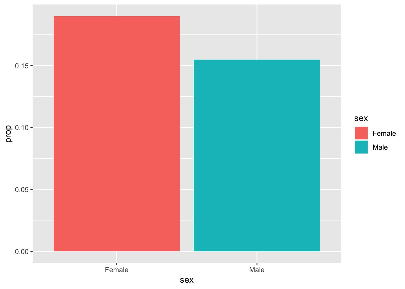
Step 1: Calculate δ.
harass_diff_sex <- gss_harass %>%
  specify(formula = harass5 ~ sex, success = "Yes") %>%
  calculate(stat = "diff in props", order = c("Female", "Male"))
harass_diff_sex
## # A tibble: 1 x 1
## stat
## <dbl>
## 1 0.0351Our δ is -0.035, which means there’s a 3.5% difference between the two groups, which we saw in the bar chart above. But is that difference real? Could it maybe be zero?
Step 2: Invent world where δ is null + Step 3: Look at δ in the null world. We use simulation to generate a world where the actual difference between these two groups is zero, and then we put δ there to see if it’s weird or unexpected.
harass_sex_diff_in_null_world <- gss_harass %>%
  select(harass5, sex) %>%
  specify(formula = harass5 ~ sex, success = "Yes") %>%
  hypothesize(null = "independence") %>%
  generate(reps = 5000) %>%
  calculate(stat = "diff in props", order = c("Female", "Male"))
## Setting `type = "permute"` in `generate()`.harass_born_diff_in_null_world %>%
visualize(obs_stat = harass_diff_sex)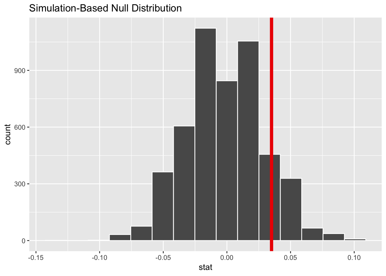
According to this, in a world where there’s no actual difference, we’d mostly see a 0% difference, but because of random chance, we could see a difference of ±5% (or more). Our sample difference of 3.5% fits fairly well in this fake world where there’s no difference.
Step 4: Calculate probability. What is the chance that we’d see that red line in the world where there’s no difference?
diff_harass_sex_pvalue <- harass_sex_diff_in_null_world %>%
  get_pvalue(obs_stat = harass_diff_sex, direction = "both")
diff_harass_sex_pvalue
## # A tibble: 1 x 1
## p_value
## <dbl>
## 1 0.0984The probability we’d see that red line in a world where there’s no difference is 0.0984.
Step 5: Decide if δ is significant. If we use a regular standard of 0.05, we definitely don’t have enough evidence to “convict”, since the p-value is so high. But that doesn’t mean that the “defendant” is not guilty. If we use a lower standard of 0.10, we do have enough evidence to convict—we’re just a little less confident that the effect is real/guilty.
Final step: Write this up. Here’s what we can say about this hypothesis test in a report:
In general, women face more harassment in the workplace than men. 19% of women report facing harassment, compared to 15.5% of men, and this 3.5% difference is significant at a 0.1 level (p = 0.1).
There are also a bunch of caveats here. The GSS doesn’t measure what kind of harassment this means: it includes bullying, sexual harassment, sexual assault, and other forms of harassment. These limitations could be masking whatever the true population effect is. But this gets us close—it’s not overwhelming beyond-reasonable-doubt evidence, but it’s pretty good.
Comparison to a fixed value
Finally, we can compare our sample statistic δ to some fixed population parameter. This is useful in situations where you want to see if you’ve hit some standard, or to see if your country is about the same happiness as another country, or similar situations. Rather than invent a world where δ is 0, we’ll invent a world where δ is some specific number.
Let’s pretend that the sat_gpa data is from students attending colleges in Utah, and let’s pretend that the state of Utah has imposed a new standard that says all universities should have an average GPA of 3.0 to qualify for some new state grant program. We want to know if our average GPA is close enough to the 3.0 standard.
Our null hypothesis is that our average GPA is 3.0. Our alternative hypothesis is that it’s not 3.0. We’re trying to prove guilt, or that the GPA is not meeting the standard.
- H0: \(\mu_{\text{GPA}} = 3.0\)
- HA: \(\mu_{\text{GPA}} \neq 3.0\)
Step 1: Calculate δ.
# We can calculate this with specify() + calculate()
avg_gpa <- sat_gpa %>%
  specify(formula = gpa_fy ~ NULL) %>%
  calculate(stat = "mean")
avg_gpa
## # A tibble: 1 x 1
## stat
## <dbl>
## 1 2.47# Or with summarize()
avg_gpa <- sat_gpa %>%
summarize(stat = mean(gpa_fy))
avg_gpa## # A tibble: 1 x 1
## stat
## <dbl>
## 1 2.47Our δ, or average GPA is 2.47. That’s low—could it maybe be 3, given variation in sampling?
Step 2: Invent world where δ is null + Step 3: Look at δ in the null world. We use simulation to generate a world where the actual mean is 3.0, and then we put δ there to see if it’s weird or unexpected.
null_state_standard <- sat_gpa %>%
  specify(gpa_fy ~ NULL) %>%
  hypothesize(null = "point", mu = 3) %>%
  generate(reps = 1000) %>%
  calculate(stat = "mean")
## Setting `type = "bootstrap"` in `generate()`.null_state_standard %>% visualize(obs_stat = avg_gpa)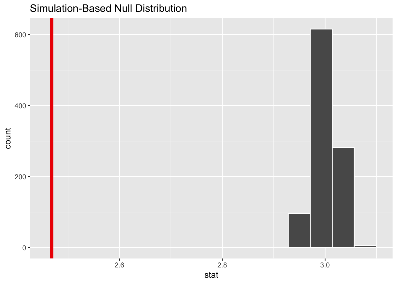
Hahaha nope. There’s no way that 2.47 could potentially be 3.0. We have overwhelming visual evidence here that we’re not meeting the standard.
Step 4: Calculate probability. What is the chance that we’d see that red line in the world where there’s no difference?
state_standard_pvalue <- null_state_standard %>%
  get_pvalue(obs_stat = avg_gpa, direction = "both")
state_standard_pvalue
## # A tibble: 1 x 1
## p_value
## <dbl>
## 1 0The probability we’d see that red line in a world where there’s no difference is 0.
Step 5: Decide if δ is significant. It’s definitely significant. We have clear evidence at pretty much any level of significance that we can reject the null hypothesis (innocence) and say that 2.47 is definitely not 3.0.
Final step: Write this up. Here’s what we can say about this hypothesis test in a report:
The average GPA in the state of Utah is 2.47, which is significantly lower than the recommended state standard of 3.0 (p < 0.001).
What if the standard was 2.5 instead of 3? Could 2.47 potentially be 2.5? Here’s a less annotated version of how to calculate that (you can do this less annotated version in real life; you don’t really need to walk through each of these steps in detail).
# Make world where standard is 2.5
null_state_standard_25 <- sat_gpa %>%
  specify(gpa_fy ~ NULL) %>%
  hypothesize(null = "point", mu = 2.5) %>%
  generate(reps = 1000) %>%
  calculate(stat = "mean")
## Setting `type = "bootstrap"` in `generate()`.# Look at it
null_state_standard_25 %>% visualize(obs_stat = avg_gpa)## Warning: `visualize()` shouldn't be used to plot p-value. Arguments
## `obs_stat`, `obs_stat_color`, `pvalue_fill`, and `direction` are
## deprecated. Use `shade_p_value()` instead.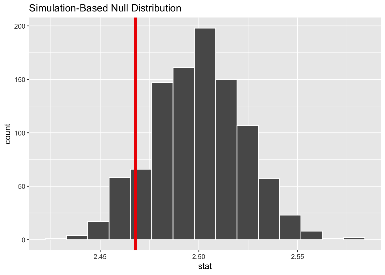
# Get p-value
state_standard_25_pvalue <- null_state_standard_25 %>%
  get_pvalue(obs_stat = avg_gpa, direction = "both")
state_standard_25_pvalue
## # A tibble: 1 x 1
## p_value
## <dbl>
## 1 0.172Our p-value here is 0.172, which means there’s a 17.2% chance that we’d see an average GPA of 2.47 in a world where it should be 2.5 (since there are issues with random chance; maybe an administrator forgot to type some grades in, or a teacher misgraded an exam, etc.).
Here’s what we can say:
The average GPA in the state of Utah is 2.47, which is not significantly lower than the recommended state standard of 2.5 (p = 0.172).
Clearest and muddiest things
Go to this form and answer these three questions:
- What was the muddiest thing from class today? What are you still wondering about?
- What was the clearest thing from class today?
- What was the most exciting thing you learned?
I’ll compile the questions and send out answers after class.