Sampling
Materials for class on Thursday, November 1, 2018
Contents
Slides
Download the slides from today’s lecture:

M&Ms
In class we used M&Ms to explore how sampling works. Here’s an analysis of this exploration in R. Load these packages to get started, and download these two datasets (and put them in a folder named “data”):
library(tidyverse)
library(moderndive)
library(pander)
library(scales)

# Setting a random seed ensures that every random draw will be the same each
# time you run this (and regardless of what computer you run this on)
set.seed(1234)

# Official M&M colors via
# - Wikipedia: https://en.wikipedia.org/wiki/M%26M%27s
# - This palette: https://colorswall.com/palette/172/
mm_red <- "#b11224"
mm_orange <- "#f26f22"
mm_yellow <- "#fff200"
mm_green <- "#31ac55"
mm_blue <- "#2f9fd7"
mm_brown <- "#603a34"
tons_of_mms <- read_csv("data/tons_of_mms.csv")
class_results <- read_csv("data/class_mms.csv")M&M reporting form
Go here to report the count of M&Ms in your bag:
The true population parameters of M&M colors
Because of the work of smart/bored statisticians (and from the Mars company itself), we actually know the true population-level parameters for the proportion of colors. For whatever reason, M&Ms’s two US factories produce a different mix of colors (perhaps the East Coast likes blue M&Ms more?). Here are the true population parameters:
mms_population <- tribble(
  ~color,   ~prop_clv, ~prop_hkp,
  "Red",    0.131,     0.125,
  "Orange", 0.205,     0.25,
  "Yellow", 0.135,     0.125,
  "Green",  0.198,     0.125,
  "Blue",   0.207,     0.25,
  "Brown",  0.124,     0.125
)

mms_population %>%
  gather(Factory, value, -color) %>%
  mutate(value = percent(value)) %>%
  spread(color, value) %>%
  mutate(Factory = recode(Factory,
                          prop_clv = "Cleveland, OH (CLV)",
                          prop_hkp = "Hackettstown, NJ (HKP)")) %>%
pandoc.table(justify = "lcccccc")| Factory | Blue | Brown | Green | Orange | Red | Yellow |
|---|---|---|---|---|---|---|
| Cleveland, OH (CLV) | 20.7% | 12.4% | 19.8% | 20.5% | 13.1% | 13.5% |
| Hackettstown, NJ (HKP) | 25.0% | 12.5% | 12.5% | 25.0% | 12.5% | 12.5% |
M&Ms in real life
Here are the results of the M&M sampling that we did in class:
Individual fun-packs
individual_data <- class_results %>%
  filter(type == "Myself") %>%
  gather(color, count, c(Blue, Brown, Green, Orange, Red, Yellow)) %>%
  mutate(prop = count / total)

individual_data %>%
  group_by(color) %>%
  summarise(avg_prop = mean(prop),
            sd_prop = sd(prop))
## # A tibble: 6 x 3
## color avg_prop sd_prop
## <chr> <dbl> <dbl>
## 1 Blue 0.188 0.0880
## 2 Brown 0.128 0.0924
## 3 Green 0.221 0.113
## 4 Orange 0.149 0.0784
## 5 Red 0.173 0.101
## 6 Yellow 0.136 0.0781ggplot(individual_data, aes(x = prop, fill = color)) +
geom_histogram(binwidth = 0.05, color = "white") +
geom_vline(data = mms_population, aes(xintercept = prop_clv),
color = "orange", size = 1, linetype = "dotted") +
labs(x = "Proportion", y = "Count", title = "Actual colors in 31 fun-sized bags",
subtitle = "Orange dotted line shows the true population value") +
scale_x_continuous(labels = percent_format(accuracy = 1)) +
scale_fill_manual(values = c(mm_blue, mm_brown, mm_green, mm_orange, mm_red, mm_yellow)) +
guides(fill = FALSE) +
theme_minimal() +
theme(panel.grid.minor = element_blank()) +
facet_wrap(~ color)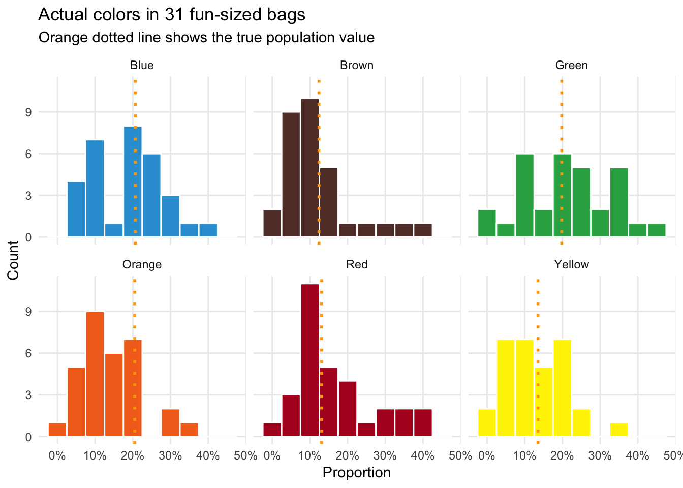
Team checkout-line-sized bags
team_data <- class_results %>%
  filter(type == "My team") %>%
  gather(color, count, c(Blue, Brown, Green, Orange, Red, Yellow)) %>%
  mutate(prop = count / total)

team_data %>%
  group_by(color) %>%
  summarise(avg_prop = mean(prop),
            sd_prop = sd(prop))
## # A tibble: 6 x 3
## color avg_prop sd_prop
## <chr> <dbl> <dbl>
## 1 Blue 0.249 0.0672
## 2 Brown 0.107 0.0493
## 3 Green 0.253 0.0530
## 4 Orange 0.152 0.0967
## 5 Red 0.142 0.0430
## 6 Yellow 0.101 0.0285ggplot(team_data, aes(x = prop, fill = color)) +
geom_histogram(binwidth = 0.05, color = "white") +
geom_vline(data = mms_population, aes(xintercept = prop_clv),
color = "orange", size = 1, linetype = "dotted") +
labs(x = "Proportion", y = "Count", title = "Actual colors in 11 checkout-line-sized bags",
subtitle = "Orange dotted line shows the true population value") +
scale_x_continuous(labels = percent_format(accuracy = 1)) +
scale_fill_manual(values = c(mm_blue, mm_brown, mm_green, mm_orange, mm_red, mm_yellow)) +
guides(fill = FALSE) +
theme_minimal() +
theme(panel.grid.minor = element_blank()) +
facet_wrap(~ color)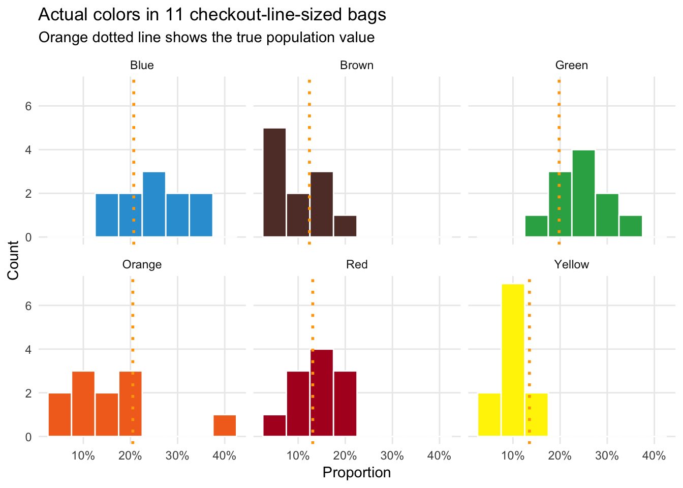
Simulated M&Ms
We can use the rep_sample_n() function from the moderndive library to simulate taking a random sample from a giant vat of 100,000 Cleveland-produced M&Ms.
Here’s what happens if we take one fun-sized sample of M&Ms:
one_fun_sized_bag <- tons_of_mms %>%
  rep_sample_n(size = 19)

one_fun_sized_bag
## # A tibble: 19 x 3
## # Groups: replicate [1]
## replicate mm_id color
## <int> <dbl> <chr>
## 1 1 41964 Yellow
## 2 1 15241 Red
## 3 1 33702 Yellow
## 4 1 83023 Brown
## 5 1 80756 Orange
## 6 1 85374 Blue
## 7 1 68158 Brown
## 8 1 59944 Brown
## 9 1 68536 Red
## 10 1 17380 Brown
## 11 1 33247 Green
## 12 1 49786 Yellow
## 13 1 16962 Brown
## 14 1 98435 Red
## 15 1 31785 Blue
## 16 1 50166 Orange
## 17 1 85832 Yellow
## 18 1 98602 Green
## 19 1 33026 GreenWe can calculate the proportion of colors in this one bag:
one_fun_sized_bag %>%
  group_by(color) %>%
  summarize(prop = n() / 19)
## # A tibble: 6 x 2
## color prop
## <chr> <dbl>
## 1 Blue 0.105
## 2 Brown 0.263
## 3 Green 0.158
## 4 Orange 0.105
## 5 Red 0.158
## 6 Yellow 0.211Just looking at one bag will result in a lot of variability. Some colors might not be in the bag; some colors might be overrepresented in the bag. We can improve our estimates of \(\widehat{p}\) by increasing the number of samples we take. Here’s what happens if we look at 40 fun-sized bags, just like we did in-person in class:
forty_fun_sized_bags <- tons_of_mms %>%
  rep_sample_n(size = 19, reps = 40)

forty_fun_sized_bags_color <- forty_fun_sized_bags %>%
  group_by(color, replicate) %>%
  summarize(prop = n() / 19)

forty_fun_sized_bags_color %>%
  summarise(avg_prop = mean(prop),
            sd_prop = sd(prop))
## # A tibble: 6 x 3
## color avg_prop sd_prop
## <chr> <dbl> <dbl>
## 1 Blue 0.209 0.0832
## 2 Brown 0.144 0.0590
## 3 Green 0.225 0.110
## 4 Orange 0.213 0.0829
## 5 Red 0.146 0.0850
## 6 Yellow 0.132 0.0660ggplot(forty_fun_sized_bags_color, aes(x = prop, fill = color)) +
geom_histogram(binwidth = 0.05, color = "white") +
geom_vline(data = mms_population, aes(xintercept = prop_clv),
color = "orange", size = 1, linetype = "dotted") +
labs(x = "Proportion", y = "Count", title = "Simulation of 40 party-sized bags",
subtitle = "Orange dotted line shows the true population value") +
scale_x_continuous(labels = percent_format(accuracy = 1)) +
scale_fill_manual(values = c(mm_blue, mm_brown, mm_green, mm_orange, mm_red, mm_yellow)) +
guides(fill = FALSE) +
theme_minimal() +
theme(panel.grid.minor = element_blank()) +
facet_wrap(~ color)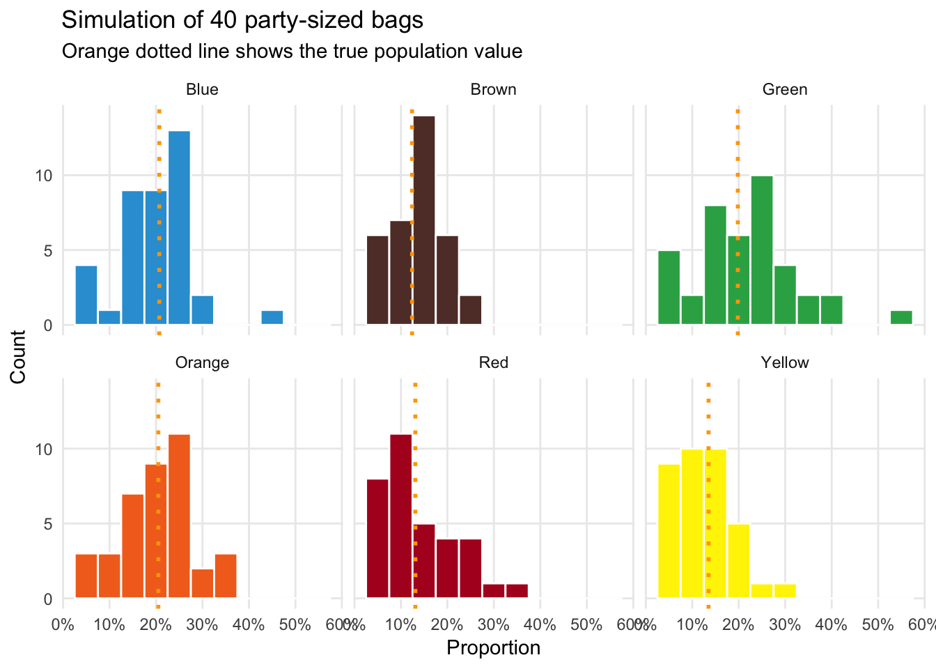
There’s still some variability, but the standard deviation is smaller than it was with just one fun-sized bag.
Next let’s simulate 10 checkout-line-sized bags (what we did as teams in class). These have roughly 55 M&Ms per bag:
ten_checkout_sized_bags <- tons_of_mms %>%
  rep_sample_n(size = 55, reps = 10)

ten_checkout_sized_bags_color <- ten_checkout_sized_bags %>%
  group_by(color, replicate) %>%
  summarize(prop = n() / 55)

ten_checkout_sized_bags_color %>%
  summarise(avg_prop = mean(prop),
            sd_prop = sd(prop))
## # A tibble: 6 x 3
## color avg_prop sd_prop
## <chr> <dbl> <dbl>
## 1 Blue 0.198 0.0510
## 2 Brown 0.138 0.0385
## 3 Green 0.202 0.0525
## 4 Orange 0.205 0.0790
## 5 Red 0.138 0.0323
## 6 Yellow 0.118 0.0570Our errors are shrinking and the means are starting to converge on the true population \(p\):
ggplot(ten_checkout_sized_bags_color, aes(x = prop, fill = color)) +
  geom_histogram(binwidth = 0.025, color = "white") +
  geom_vline(data = mms_population, aes(xintercept = prop_clv),
             color = "orange", size = 1, linetype = "dotted") +
  labs(x = "Proportion", y = "Count", title = "Simulation of 10 checkout-line-sized bags",
       subtitle = "Orange dotted line shows the true population value") +
  scale_x_continuous(labels = percent_format(accuracy = 1)) +
  scale_fill_manual(values = c(mm_blue, mm_brown, mm_green, mm_orange, mm_red, mm_yellow)) +
  guides(fill = FALSE) +
  theme_minimal() +
  theme(panel.grid.minor = element_blank()) +
  facet_wrap(~ color)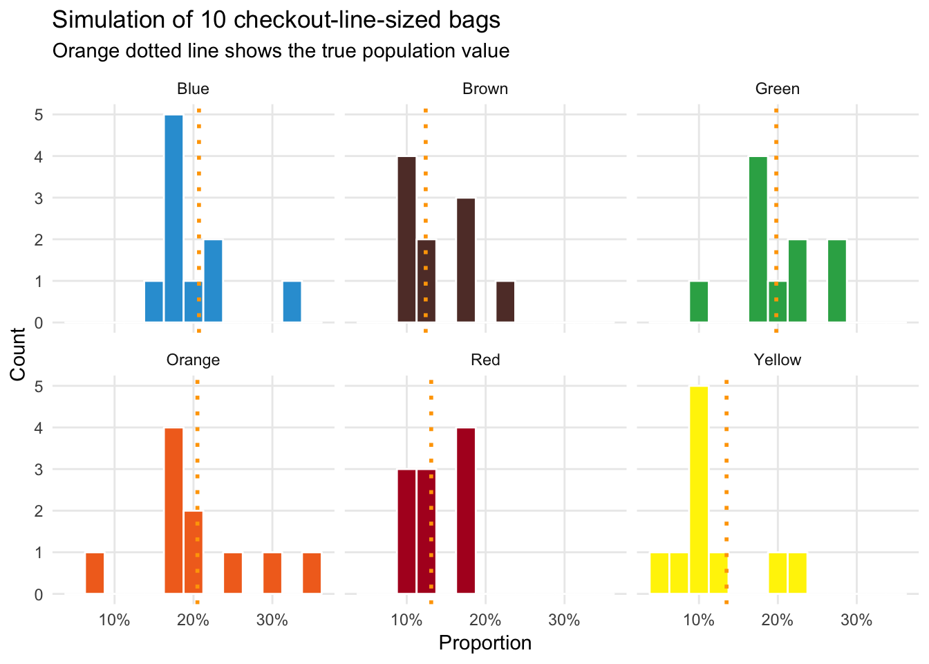
Now let’s move beyond what we did in class. Let’s simulate 10 party-sized bags (42 ounces; each contains roughly 1,000 M&Ms):
ten_party_sized_bags <- tons_of_mms %>%
  rep_sample_n(size = 1000, reps = 10)

ten_party_sized_bags_color <- ten_party_sized_bags %>%
  group_by(color, replicate) %>%
  summarize(prop = n() / 1000)

ten_party_sized_bags_color %>%
  summarise(avg_prop = mean(prop),
            sd_prop = sd(prop))
## # A tibble: 6 x 3
## color avg_prop sd_prop
## <chr> <dbl> <dbl>
## 1 Blue 0.206 0.0115
## 2 Brown 0.123 0.0123
## 3 Green 0.198 0.0137
## 4 Orange 0.206 0.00950
## 5 Red 0.129 0.0130
## 6 Yellow 0.138 0.00959The errors are now substantially smaller. Check out how little variation there is!
ggplot(ten_party_sized_bags_color, aes(x = prop, fill = color)) +
  geom_histogram(binwidth = 0.025, color = "white") +
  geom_vline(data = mms_population, aes(xintercept = prop_clv),
             color = "orange", size = 1, linetype = "dotted") +
  labs(x = "Proportion", y = "Count", title = "Simulation of 10 party-sized bags",
       subtitle = "Orange dotted line shows the true population value") +
  scale_x_continuous(labels = percent_format(accuracy = 1)) +
  scale_fill_manual(values = c(mm_blue, mm_brown, mm_green, mm_orange, mm_red, mm_yellow)) +
  guides(fill = FALSE) +
  theme_minimal() +
  theme(panel.grid.minor = element_blank()) +
  facet_wrap(~ color)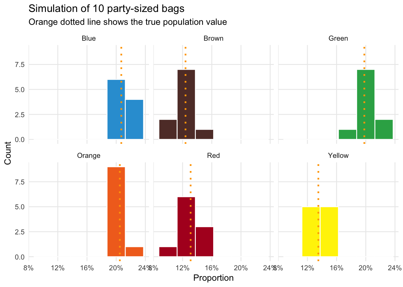
With only 10 large-ish bags of M&Ms (420 ounces, or 26.25 pounds), we can guess the proportion of colors for the entire population of M&Ms created in Cleveland with fairly high confidence. That’s amazing.
The importance of sample size
As a final demonstration of this, here’s a simulation of what happens to our \(\widehat{p}\) estimates and margins of error as we increase the sample size from 5 to 1,000. The x-axis here show the sample size; the y-axis shows the \(\widehat{p}\) for each color at that sample size; the orange ribbon shows the 95% confidence interval, or margin of error; the black horizontal line shows the true population average.
different_ns <- tibble(n = seq(5, 1000, 1)) %>%
  mutate(draw = n %>% map(~ rep_sample_n(tons_of_mms, size = .x, reps = 1))) %>%
  unnest(draw) %>%
  group_by(n, color) %>%
  summarize(prop = n() / max(n)) %>%
  # This is the real way of calculating the margin of error; we'll talk about this next week
  mutate(se = sqrt(prop * (1 - prop) / n),
         moe = 1.96 * se,
         lower_ci = prop - moe,
         upper_ci = prop + moe)

ggplot(different_ns, aes(x = n, y = prop)) +
  geom_ribbon(aes(ymin = lower_ci, ymax = upper_ci), fill = "orange") +
  geom_line(size = 0.25) +
  geom_hline(data = mms_population, aes(yintercept = prop_clv), size = 2, color = "white") +
  geom_hline(data = mms_population, aes(yintercept = prop_clv), size = 0.75, color = "black") +
  labs(x = "Sample size (n)", y = "Proportion", title = "Accuracy of p-hat as sample size increases",
       subtitle = "Black horizontal line shows the true population value ") +
  scale_y_continuous(labels = percent_format(accuracy = 1)) +
  scale_x_continuous(labels = comma) +
  facet_wrap(~ color) +
  theme_minimal() +
  theme(panel.grid.minor = element_blank())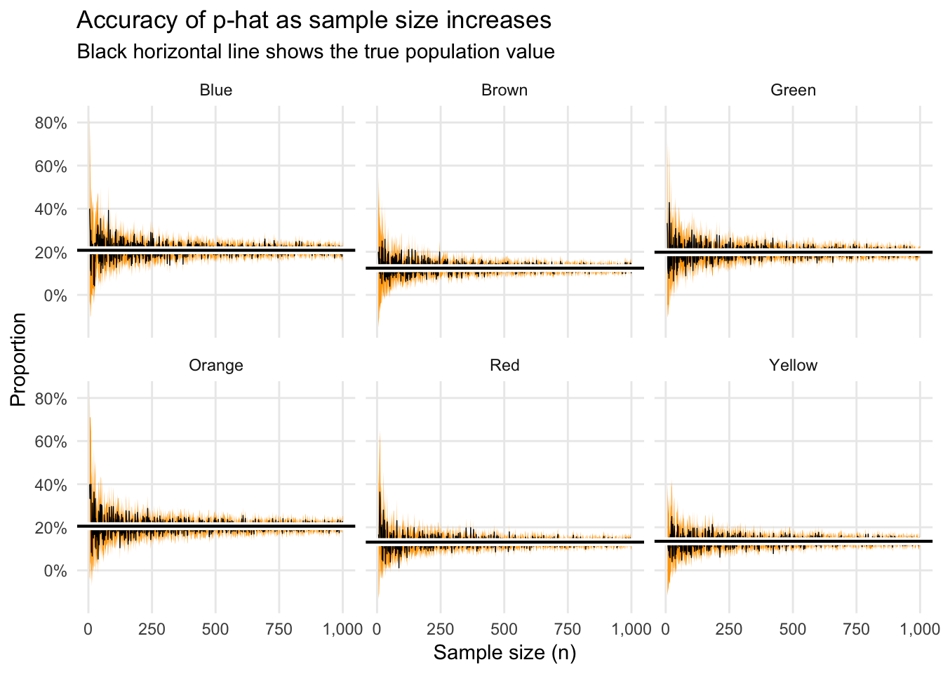
Notice how the estimates and errors converge on the true \(p\) fairly quickly. When \(n\) is small, there’s a lot of variation, but once it’s 250+, there’s not a huge improvement as you increase the sample size.
This is even more apparent if we plot just the changes in the margin of error as we increase \(n\):
ggplot(different_ns, aes(x = n, y = moe)) +
  geom_point(size = 0.25, alpha = 0.25) +
  labs(x = "Sample size (n)", y = "Margin of error (± this percent)") +
  scale_y_continuous(labels = percent_format(accuracy = 1)) +
  scale_x_continuous(labels = comma) +
  theme_minimal() +
  theme(panel.grid.minor = element_blank())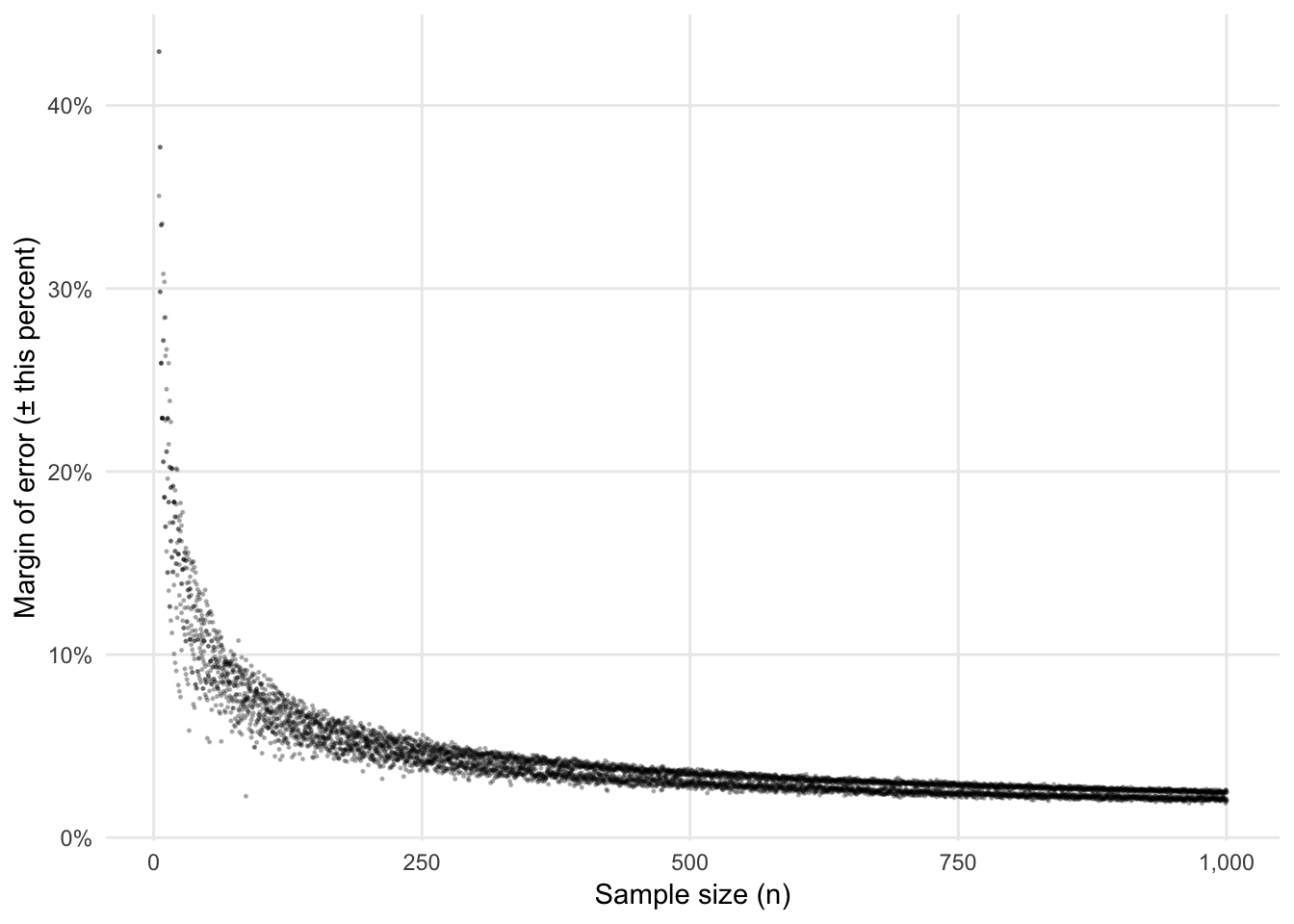
Notice how low the margin of error is at 1,000. Given that there are roughly 1,000 M&Ms in a 42 ounce party bag, we can make a pretty good guess (with a margin of error of 2ish%) of the actual population-level distribution of colors with just one big bag of M&Ms. That’s mindblowing.
This is why presidential approval polls tend to have \(n\)s that seem really low (1,300; 1,500; 800, etc.). Polls with these sample sizes all have margins of error of 2–3%. Bumping up the sample size to 10,000 or something huge would shrink the margins of error, but not by a huge amount. If we took a sample of 10,000 M&Ms, here’s what our margin of error would be:
tons_of_mms %>%
  rep_sample_n(10000) %>%
  group_by(color) %>%
  summarize(prop = n() / 10000) %>%
  mutate(se = sqrt(prop * (1 - prop) / 10000),
         moe = 1.96 * se,
         lower_ci = prop - moe,
         upper_ci = prop + moe)
## # A tibble: 6 x 6
## color prop se moe lower_ci upper_ci
## <chr> <dbl> <dbl> <dbl> <dbl> <dbl>
## 1 Blue 0.205 0.00404 0.00791 0.197 0.213
## 2 Brown 0.124 0.00330 0.00647 0.118 0.131
## 3 Green 0.201 0.00401 0.00785 0.193 0.209
## 4 Orange 0.205 0.00404 0.00791 0.197 0.213
## 5 Red 0.131 0.00337 0.00661 0.124 0.137
## 6 Yellow 0.134 0.00341 0.00668 0.127 0.141Between 0.65% and 0.8%, depending on the color. That’s definitely an improvement over 2%, but it’s not huge. Consider, for instance, moving from a sample size of 20, where the margin of error is 20ish%, to a sample size of 500, where it’s around 4%. Increasing sample sizes at the low end of the spectrum results in huge gains to \(\widehat{p}\) accuracy. Increasing sample sizes from high to even higher doesn’t end up helping all that much with accuracy.
Pew, CNN, Quinnipiac, and others face a tradeoff: take huge (expensive) samples to get the most accurate estimate of \(\widehat{p}\), or take smaller (cheaper) samples to get \(\widehat{p}\) estimates that are less accurate, but still pretty darn accurate in the end. They lean towards the cheaper option.
Clearest and muddiest things
Go to this form and answer these three questions:
- What was the muddiest thing from class today? What are you still wondering about?
- What was the clearest thing from class today?
- What was the most exciting thing you learned?
I’ll compile the questions and send out answers after class.