Regression diagnostics and prediction
Materials for class on Thursday, October 25, 2018
Contents
Slides
Download the slides from today’s lecture:

Code from today
In class we used multiple regression to explore the factors that explain the 2016 US presidential election results and the results of the 2016 Brexit vote in the UK.
You can download these files from here if you want to follow along (make an RStudio project, put them in a data folder, and you’ll be good to go):
-
results_2016.csvThis data comes from the MIT Election Data and Science Lab
-
brexit_results.csvThis data comes from Elliott Morris, who cleaned it up and made it available through hisDataCamp class (which you should check out while you have access to the full DataCamp library!)
Load and wrangle data
First we load the necessary packages:
library(tidyverse)
library(moderndive)

# The broom package lets us manipulate model objects and makes it easier to
# generate predictions and plot them
library(broom)
Then we load the data. The data is already precleaned and tidy and ready to use, so we don’t have to do any wrangling here.
results_2016 <- read_csv("data/results_2016.csv")
results_brexit <- read_csv("data/brexit_results.csv")
2016 US Presidential Election
Let’s explore variation in democratic party vote share in 2016. Our main outcome variable (or y) is percent_dem, which is the percent of presidential votes cast for the Democratic party (on a scale of 0–100). Here’s a histogram to give you a sense of the data. King County, Texas only had 3% of its presidential votes cast for Hilary Clinton, while 90% of Washington, DC voted for her.
ggplot(results_2016, aes(x = percent_dem)) +
  geom_histogram(binwidth = 2.5)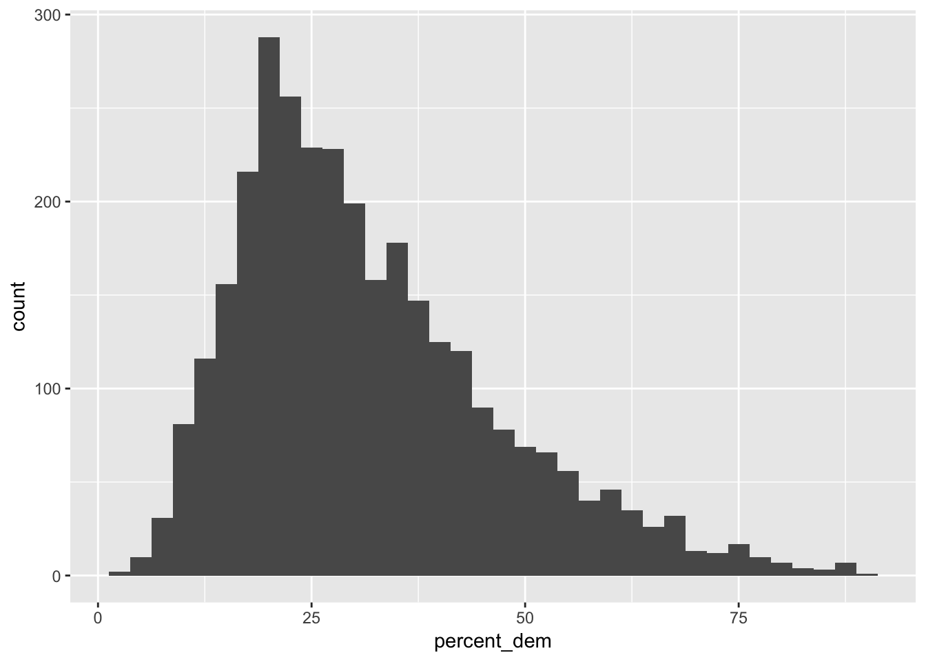
Percent democratic explained by age
Let’s first test the old adage that people become more conservative as they get older. The correlation between a county’s median and age and the democratic vote share is moderately negative:
results_2016 %>%
  # There are some missing values in each of these columns, so we have to filter
  # them out first before checking the correlation
  filter(!is.na(percent_dem), !is.na(median_age)) %>%
  get_correlation(percent_dem ~ median_age)
## # A tibble: 1 x 1
## correlation
## <dbl>
## 1 -0.298It looks negative too:
ggplot(results_2016, aes(x = median_age, y = percent_dem)) +
  geom_point(alpha = 0.25) +
  geom_smooth(method = "lm")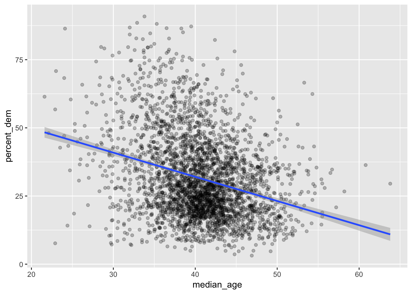
If we run a regression model, we can find the slope and \(R^2\) and other information:
us_dem_age <- lm(percent_dem ~ median_age, data = results_2016)

get_regression_table(us_dem_age)
## # A tibble: 2 x 7
## term estimate std_error statistic p_value lower_ci upper_ci
## <chr> <dbl> <dbl> <dbl> <dbl> <dbl> <dbl>
## 1 intercept 67.5 2.09 32.4 0 63.4 71.6
## 2 median_age -0.887 0.051 -17.4 0 -0.987 -0.787get_regression_summaries(us_dem_age)## # A tibble: 1 x 8
## r_squared adj_r_squared mse rmse sigma statistic p_value df
## <dbl> <dbl> <dbl> <dbl> <dbl> <dbl> <dbl> <dbl>
## 1 0.089 0.088 212. 14.6 14.6 302. 0 2The intercept here (\(\beta_0\)) means that in a hypothetical county where the median age is 0 years, the predicted democratic vote share would be 67.5%. That’s impossible though, because no counties consist entirely of babies. So we can ignore it.
The slope for median age (\(\beta_1\)) is -0.887. This means that on average, a 1 year increase in the median age in a county is associated with a drop in democratic vote share of 0.887%. Or in other words, if a county that had 40% voting for democrats got a year older, we could predict a democratic vote share of 39.113% (40 − 0.887).
The \(R^2\) is 0.089 (we use the regular \(R^2\) because we only have one explanatory variable), which means that this model explains 8.9% of the variation in democratic vote share. It’s not that great of a model.
Percent democratic explained by age and race
We can improve the model by including additional explanatory variables, such as race:
model_age_dem_race <- lm(percent_dem ~ median_age + percent_white,
                         data = results_2016)

get_regression_table(model_age_dem_race)
## # A tibble: 3 x 7
## term estimate std_error statistic p_value lower_ci upper_ci
## <chr> <dbl> <dbl> <dbl> <dbl> <dbl> <dbl>
## 1 intercept 70.4 1.76 39.9 0 66.9 73.8
## 2 median_age -0.094 0.049 -1.93 0.053 -0.189 0.001
## 3 percent_white -0.448 0.013 -35.3 0 -0.473 -0.423get_regression_summaries(model_age_dem_race)## # A tibble: 1 x 8
## r_squared adj_r_squared mse rmse sigma statistic p_value df
## <dbl> <dbl> <dbl> <dbl> <dbl> <dbl> <dbl> <dbl>
## 1 0.35 0.349 151. 12.3 12.3 836. 0 3Now we have two coefficients to work through (again, the intercept is nonsensical; it shows what the democratic vote share would be if the median age were 0 and if the percent of white people in a county were 0%).
The slope for median age (\(\beta_1\)) is -0.094, which means that controlling for race, a 1 year increase in age is associated with a decrease in democratic vote share of 0.094, on average. This means that in a hypothetical county where 40% voted for democrats, we could predict that bumping age up by a year would result in 39.906%. That’s a tiny effect—controlling for race took away most of the effect of age from the previous model.
The coefficient for percent white (\(\beta_2\)) is -0.448, which means that controlling for age, a 1% increase in the proportion of whites in a county is associated with a drop in democratic vote share of 0.448, on average. This would be like moving from 40% to 39.552%.
To explain model fit, we need to look at the adjusted \(R^2\) because we’re using more than one explanatory variable. This model explains 34.9% of the variation in democratic vote share. It’s getting better!
Percent democratic explained by lots of things
Now let’s throw in a ton of explanatory variables to see what other factors might explain democratic vote share:
model_lots_of_stuff <- lm(percent_dem ~ median_age + percent_white +
                            per_capita_income + median_rent + state,
                          data = results_2016)

get_regression_table(model_lots_of_stuff)
## # A tibble: 54 x 7
## term estimate std_error statistic p_value lower_ci upper_ci
## <chr> <dbl> <dbl> <dbl> <dbl> <dbl> <dbl>
## 1 intercept 58.5 1.66 35.3 0 55.2 61.8
## 2 median_age 0.166 0.037 4.52 0 0.094 0.238
## 3 percent_white -0.682 0.011 -61.9 0 -0.704 -0.661
## 4 per_capita_income 0 0 5.46 0 0 0
## 5 median_rent 0.02 0.002 12.3 0 0.017 0.023
## 6 stateArizona -7.96 2.18 -3.65 0 -12.2 -3.69
## 7 stateArkansas 4.08 1.28 3.19 0.001 1.57 6.58
## 8 stateCalifornia -2.45 1.50 -1.64 0.102 -5.38 0.485
## 9 stateColorado 1.81 1.36 1.34 0.182 -0.848 4.47
## 10 stateConnecticut 11.8 2.87 4.10 0 6.12 17.4
## # … with 44 more rowsget_regression_summaries(model_lots_of_stuff)## # A tibble: 1 x 8
## r_squared adj_r_squared mse rmse sigma statistic p_value df
## <dbl> <dbl> <dbl> <dbl> <dbl> <dbl> <dbl> <dbl>
## 1 0.759 0.755 56.1 7.49 7.56 182. 0 54Now we’re controlling for age, race, income, rent, and state, which gives our model a lot more explanatory power. The adjusted \(R^2\) is 0.755, which means that this model explains 75.5% of the variation in democratic vote share. Neat!
Interestingly, when controlling for race, income, rent prices, and state, the coefficient for age is now positive—a 1 year increase in the median age in a county is associated with a 0.166 unit increase in the share of democratic votes (e.g. moving from 40% to 40.166%), on average. This goes contrary to the old adage that people vote more conservative as they go older. They still do—that’s apparent from the scatterplot that we showed earlier—but the reason that happens isn’t necessarily because of age. The coefficient for percent white is -0.682, which means a 1% increase in the proportion of whites in a county is associated with a decrease of 0.682 in the share of democratic votes, on average (e.g. moving from 40% to 39.318%).
State effects also explain what’s happening. The base case here is Alabama, so all state coefficients are compared to that. NOTICE ALSO that Alaska is missing. That’s because this dataset is missing lots of details about Alaska, like median age, percent white, etc. R drops out rows where any of the explanatory variables are missing, so Alaska disappears from this model. The interpretation of these state effects aren’t entirely useful here. Arizona had a 7.96% lower share of democratic votes than Alabama, controlling for age, race, income, and rent, on average. Arkansas had a 4.08% higher share of democratic votes than Alabama, controlling for age, race, income, and rent, on average. And so on, ad nauseum.
These coefficients are helpful because they filter out and account for state-related variation in vote share, but on their own they’re not super helpful. Because of that, we can actually omit them from our regression table with filter():
get_regression_table(model_lots_of_stuff) %>%
  # str_detect looks inside a column to see if a specific string of text exists
  # (in this case "state"). We negate it with ! so it'll only select rows where
  # the phrase "state" isn't in it
  filter(!str_detect(term, "state"))
## # A tibble: 5 x 7
## term estimate std_error statistic p_value lower_ci upper_ci
## <chr> <dbl> <dbl> <dbl> <dbl> <dbl> <dbl>
## 1 intercept 58.5 1.66 35.3 0 55.2 61.8
## 2 median_age 0.166 0.037 4.52 0 0.094 0.238
## 3 percent_white -0.682 0.011 -61.9 0 -0.704 -0.661
## 4 per_capita_income 0 0 5.46 0 0 0
## 5 median_rent 0.02 0.002 12.3 0 0.017 0.023All models side-by-side
We can use the huxreg() function in the huxtable library to make a table where these models are shown in columns:
library(huxtable)

# We don't want to include state coefficients, so here we make a list of all the
# state coefficient names, then we tell huxreg() to ignore them
state_coefs <- tidy(model_lots_of_stuff) %>%
  filter(str_detect(term, "state")) %>%
  pull(term)

huxreg(us_dem_age, model_age_dem_race, model_lots_of_stuff,
       omit_coefs = state_coefs) %>%
  # This inserts a row named "State controls" at the bottom of the table marking
  # whether or not we've included state as an explanatory variable. We do this
  # so we don't have to include 50 rows of state coefficients
  add_rows(hux("State controls", "No", "No", "Yes"),
after = nrow(.) - 5)| (1) | (2) | (3) | |
| (Intercept) | 67.52 *** | 70.36 *** | 58.50 *** |
| (2.09) | (1.76) | (1.66) | |
| median_age | -0.89 *** | -0.09 | 0.17 *** |
| (0.05) | (0.05) | (0.04) | |
| percent_white | -0.45 *** | -0.68 *** | |
| (0.01) | (0.01) | ||
| per_capita_income | 0.00 *** | ||
| (0.00) | |||
| median_rent | 0.02 *** | ||
| (0.00) | |||
| State controls | No | No | Yes |
| N | 3111 | 3111 | 3111 |
| R2 | 0.09 | 0.35 | 0.76 |
| logLik | -12746.87 | -12221.27 | -10678.35 |
| AIC | 25499.73 | 24450.55 | 21466.70 |
| *** p < 0.001; ** p < 0.01; * p < 0.05. | |||
Brexit
Now let’s explore variation in the 2016 Brexit vote results. Our main outcome variable (or y) is leave_share, which is the percent of votes cast in favor of leaving the European Union. Each row is a parliamentary constituency. Again, to give you a sense of the spread of the data, here’s a histogram of the leave share in all constituencies:
ggplot(results_brexit, aes(x = leave_share)) +
  geom_histogram(binwidth = 2.5)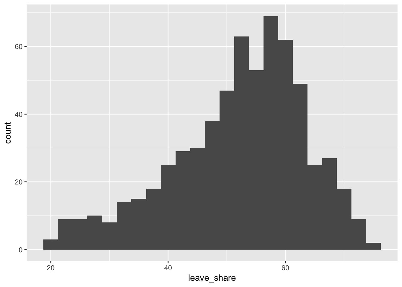
Leave share explained by immigration
One common explanation for the Brexit outcome is fear of immigration and the EU’s more open border policy. We can check the relationship between daily contact with immigrants and the propensity to vote to leave the EU by looking at the relationship between the proportion of native born residents in a constituency and its leave share.
results_brexit %>%
  get_correlation(leave_share ~ born_in_uk)
## # A tibble: 1 x 1
## correlation
## <dbl>
## 1 0.493The correlation is almost 0.5, which shows that the two are fairly well positively correlated. As the proportion of native-born residents in a constituency goes up, the share of leave vote also goes up.
That’s apparent from the scatterplot too:
ggplot(results_brexit, aes(x = born_in_uk, y = leave_share)) +
  geom_point(alpha = 0.5) +
  geom_smooth(method = "lm")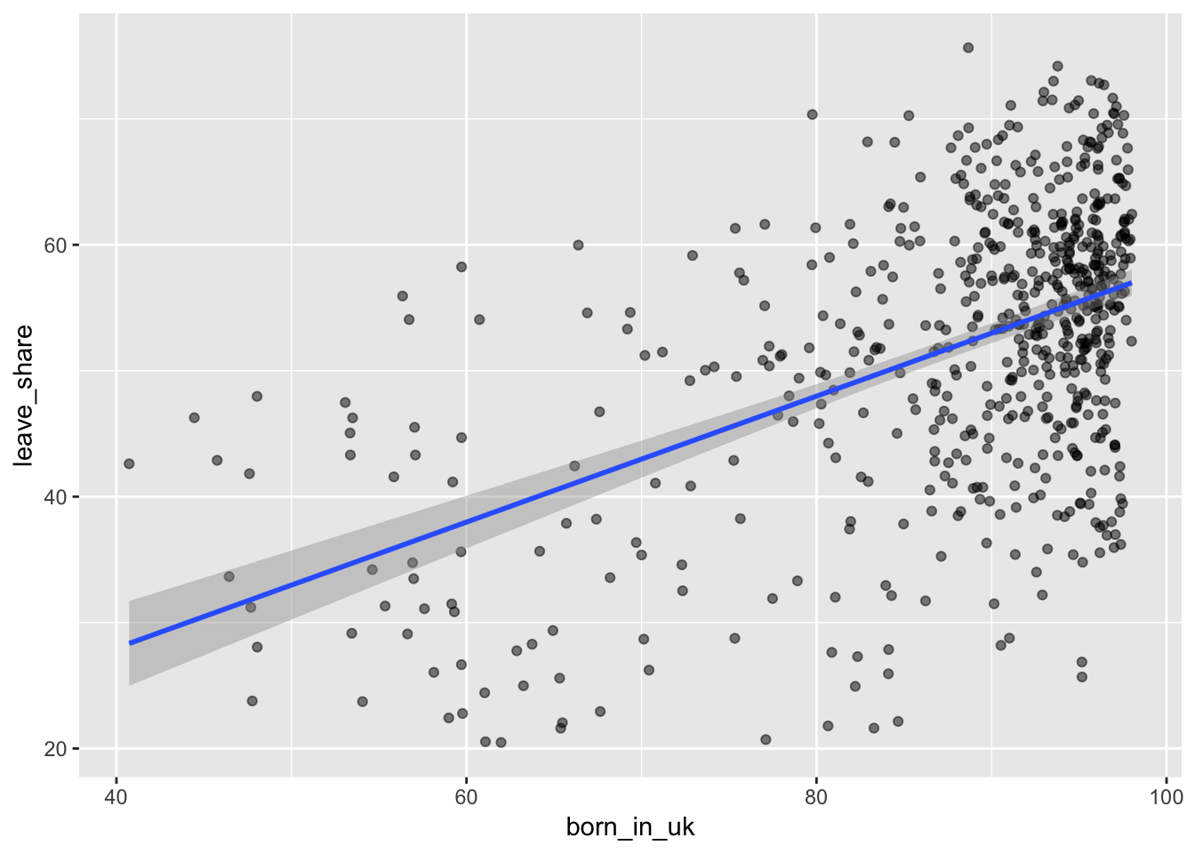
A simple regression model will show us the slope, or the effect of immigrant populations on the share of leave votes:
brexit_leave_immigration <- lm(leave_share ~ born_in_uk, data = results_brexit)

get_regression_table(brexit_leave_immigration)
## # A tibble: 2 x 7
## term estimate std_error statistic p_value lower_ci upper_ci
## <chr> <dbl> <dbl> <dbl> <dbl> <dbl> <dbl>
## 1 intercept 7.98 3.12 2.56 0.011 1.85 14.1
## 2 born_in_uk 0.5 0.035 14.2 0 0.431 0.569get_regression_summaries(brexit_leave_immigration)## # A tibble: 1 x 8
## r_squared adj_r_squared mse rmse sigma statistic p_value df
## <dbl> <dbl> <dbl> <dbl> <dbl> <dbl> <dbl> <dbl>
## 1 0.243 0.242 98.8 9.94 9.96 203. 0 2Interpretation time! The intercept shows what the average leave share would be in a constituency where 0% of the population was born in the UK. There are none of those—the most heavily immigrant-populated constituency is just over 40% native-born (see the scatterplot above). We can ignore the intercept.
The slope of born in the UK (\(\beta_1\)) is 0.5, which means that a 1% increase in the proportion of native UK residents is associated with an increase in the leave vote share of 0.5, on average (e.g. moving from 50% leave to 50.5% leave).
The \(R^2\) (the simple one, since we only have one explanatory variable) shows that this model explains 24.3% of the variation in leave votes.
Leave share explained by education and age
Another common explanation for the Brexit outcome is that it was driven by older people with less education. Let’s see if that checks out by using degree (which measures the percent of constituency’s population with a university degree) and age_18to24 (which measures the percent of a constituency’s population between the ages of 18 and 24).
First we can check the relationships on their own. First, the correlation:
results_brexit %>%
  # Some of these constituencies have missing data about education, so we remove
  # rows where that's missing
  filter(!is.na(degree), !is.na(leave_share)) %>%
  get_correlation(leave_share ~ degree)
## # A tibble: 1 x 1
## correlation
## <dbl>
## 1 -0.906−0.9! That’s huge. The two are very strongly negatively correlated. As the education level of a constituency goes up, the share of leave votes goes down a ton. It’s very apparent in the plot too—all the points are very tightly clustered around the line:
ggplot(results_brexit, aes(x = degree, y = leave_share)) +
  geom_point() +
  geom_smooth(method = "lm")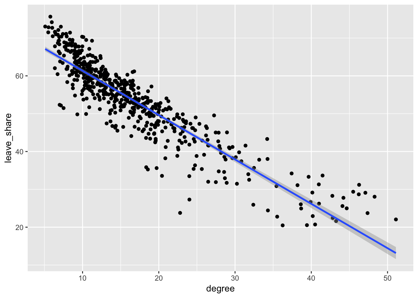
We can also check the correlation between leave votes and age:
results_brexit %>%
  get_correlation(leave_share ~ age_18to24)
## # A tibble: 1 x 1
## correlation
## <dbl>
## 1 -0.347Age and leave votes are moderately negatively correlated (r = −0.35). Again, we can see this in the plot—the relationship is negative, but the points aren’t that tightly packed around the line. (Also this chart reads kind of backwards: as you go along the x-axis, constituencies are actually getting younger, since this is measuring the proportion of the county that is between 18 and 24. A greater proportion means more young kids.)
ggplot(results_brexit, aes(x = age_18to24, y = leave_share)) +
  geom_point() +
  geom_smooth(method = "lm")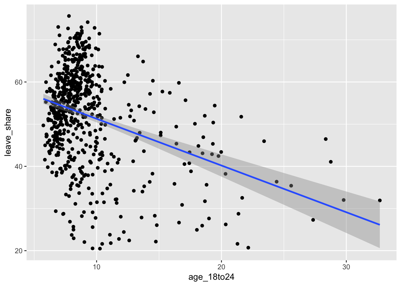
Let’s look at the effect of both of these on the leave share with a multiple regression model:
leave_educ_age <- lm(leave_share ~ degree + age_18to24, data = results_brexit)

get_regression_table(leave_educ_age)
## # A tibble: 3 x 7
## term estimate std_error statistic p_value lower_ci upper_ci
## <chr> <dbl> <dbl> <dbl> <dbl> <dbl> <dbl>
## 1 intercept 76.5 0.558 137. 0 75.4 77.6
## 2 degree -1.12 0.022 -50.8 0 -1.17 -1.08
## 3 age_18to24 -0.456 0.052 -8.85 0 -0.557 -0.355get_regression_summaries(leave_educ_age)## # A tibble: 1 x 8
## r_squared adj_r_squared mse rmse sigma statistic p_value df
## <dbl> <dbl> <dbl> <dbl> <dbl> <dbl> <dbl> <dbl>
## 1 0.843 0.842 18.3 4.28 4.29 1528. 0 3If we take the age of a constituency into account, a 1% increase in the proportion of the constituency with a university degree is associated with a 1.12 point drop in the share of leave votes (e.g. moving from 50% leave to 48.88% leave). Similarly, controlling for education, a 1% increase in the proportion of the constituency that is between 18 and 24 years old is associated with a 0.456 point drop in the share of leave vote (e.g. moving from 50% leave to 49.54%).
Both age and education have a negative effect on leave votes—constituencies that are younger and more educated had far fewer leave votes, on average.
This model explains an astonishing 84.2% of the variation in leave votes.
Leave share explained by political party
One final common explanation for the Brexit outcome is the role that UKIP played (Boris Johnson’s party; a far-right, populist, anti-EU party). We can see the relationship between how strong of a presence UKIP has in a constituency (based on its vote share in the 2015 parliamentary elections) and leave share.
Here we can see the relationship between Labour votes, Conservative votes, and UKIP votes. (To plot three political parties at the same time, I use gather() to make a longer data frame with a column named party and a column named party_pct).
brexit_parties <- results_brexit %>%
  gather(party, party_pct, c(con_2015, lab_2015, ukip_2015))

ggplot(brexit_parties, aes(x = party_pct, y = leave_share, color = party)) +
  geom_point(alpha = 0.25) +
  geom_smooth(method = "lm") +
  theme(legend.position = "bottom")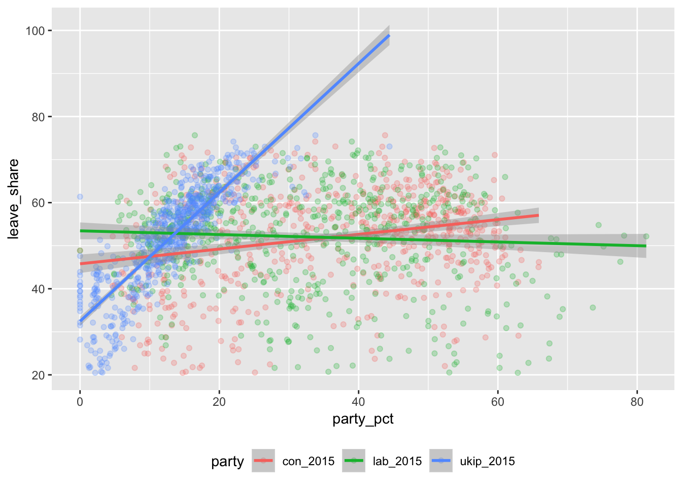
Holy cow look at that UKIP line. The points are densely packed around the line, meaning that there’s a very strong positive correlation—the more a constituency voted for UKIP in 2015, the more it voted to leave the EU in 2016.
Let’s look at the model to get the slopes (or effects):
leave_politics <- lm(leave_share ~ con_2015 + lab_2015 + ukip_2015,
                     data = results_brexit)

get_regression_table(leave_politics)
## # A tibble: 4 x 7
## term estimate std_error statistic p_value lower_ci upper_ci
## <chr> <dbl> <dbl> <dbl> <dbl> <dbl> <dbl>
## 1 intercept 33.1 1.24 26.7 0 30.7 35.5
## 2 con_2015 0.007 0.02 0.322 0.747 -0.034 0.047
## 3 lab_2015 -0.026 0.019 -1.32 0.188 -0.064 0.013
## 4 ukip_2015 1.49 0.039 38.0 0 1.41 1.57get_regression_summaries(leave_politics)## # A tibble: 1 x 8
## r_squared adj_r_squared mse rmse sigma statistic p_value df
## <dbl> <dbl> <dbl> <dbl> <dbl> <dbl> <dbl> <dbl>
## 1 0.72 0.718 36.6 6.05 6.07 538. 0 4Interpretation time. Here we go.
Controlling for a constituency’s Labour and UKIP voting patterns, a 1% increase in the votes cast for the Conservative party in 2015 is associated with a 0.007 point increase in the share of leave votes on, average (e.g. moving from 50% to 50.007%), which is pretty much a sign that there’s no effect. Controlling for a constituency’s Conservative and UKIP voting patterns, a 1% increase in the votes cast for the Labour party in 2015 is associated with a 0.026 point drop in the share of leave votes, on average (e.g. moving from 50% to 49.97%). Labour constituencies were less likely to vote to leave, but only slightly. However, taking into account Labour and Conservative voting patterns, a 1% increase in the votes cast for UKIP in 2015 is associated with a 1.49 point increase in the share of leave votes (e.g. moving from 50% to 51.49%), which is quite a sizable effect.
This model explains 71.8% of the variation in the share of leave votes, which is pretty good. Just knowing how much of a presence UKIP has in a constituency is a good predictor of how it voted in the Brexit referendum.
Leave share explained by lots of things
So far we’ve looked at immigration, education, age, and political party as explanations of the Brexit vote. How do these explanations change when we account for all these factors at once?
First, let’s run a big model:
leave_everything <- lm(leave_share ~ con_2015 + lab_2015 + ukip_2015 +
                         degree + age_18to24 + born_in_uk, data = results_brexit)

get_regression_table(leave_everything)
## # A tibble: 7 x 7
## term estimate std_error statistic p_value lower_ci upper_ci
## <chr> <dbl> <dbl> <dbl> <dbl> <dbl> <dbl>
## 1 intercept 56.4 2.64 21.4 0 51.2 61.6
## 2 con_2015 0.155 0.017 9.38 0 0.123 0.188
## 3 lab_2015 0.059 0.015 3.84 0 0.029 0.09
## 4 ukip_2015 0.713 0.038 18.9 0 0.639 0.787
## 5 degree -0.87 0.029 -29.6 0 -0.928 -0.813
## 6 age_18to24 -0.196 0.044 -4.43 0 -0.283 -0.109
## 7 born_in_uk -0.054 0.018 -3.08 0.002 -0.088 -0.019get_regression_summaries(leave_everything)## # A tibble: 1 x 8
## r_squared adj_r_squared mse rmse sigma statistic p_value df
## <dbl> <dbl> <dbl> <dbl> <dbl> <dbl> <dbl> <dbl>
## 1 0.915 0.914 9.94 3.15 3.17 1012. 0 7I’ll interpret all the coefficients here so that you can get more practice reading these tables. In real life, you’d probably only be concerned about one or two of the explanatory variables (i.e. if you were only looking at the effect of age and education on leave vote share), so you’d only need to interpret those. The other control variables are essential—they explain part of the variation in vote share, and they let us isolate the effect of individual variables—but they don’t always have to be interpreted in your text in sentences.
- Taking into account Labour and UKIP voting patterns, education, age, and immigration patterns, a 1% increase in the votes cast for the Conservative party in 2015 is associated with a 0.155 point increase in the share of leave votes in a constituency, on average (e.g. moving from 50% to 50.155%). This shows that Conservative constituencies tended to lean more towards “Leave”, but only slightly.
- Controlling for Conservative and UKIP voting patterns, education, age, and immigration patterns, a 1% increase in 2015 Labour votes is associated with a 0.059 point increase in the share of leave votes, on average. This shows that (surprisingly) Labour constituencies also tended to lean towards “Leave”, but only very slightly (e.g. moving from 50% to 50.06%).
- Controlling for Labour and Conservative voting patterns, education, age, and immigration patterns, a 1% increase in 2015 UKIP votes is associated with a 0.713 point increase in the share of leave votes in a constituency, on average. This shows that UKIP constituencies were a lot more likely to vote to leave, and that UKIP turnout is a pretty good predictor of voting to leave
- Taking political party, age, and immigration patterns into account, a 1% increase in the proportion of a constituency with a university degree is associated with a 0.87 point drop in the share of leave votes (e.g. moving from 50% to 49.13%). After taking other factors into account, education is a great predictor of voting to leave.
- Controlling for political party, education, and immigration patterns, a 1% increase in the proportion of a constituency between the ages of 18 and 24 is associated with a 0.196 point drop in the share of leave votes, on average. As constituencies becomes younger, they’re less likely to vote to leave the EU.
- Finally, taking into account political party, education, and age, a 1% increase in the proportion of native-born residents is associated with a 0.054 point drop in the share of leave votes (e.g. moving from 50% to 50.05%), which is not a huge effect (it’s the same size as the Labour Party effect, only in reverse). It also goes opposite to our intuition—once we account for all these other factors, more native-heavy constituencies are actually less likely to vote to leave (but only slightly so).
In the end, the factors that made the biggest difference in Brexit vote outcomes appear to be UKIP voting and education, followed by age and Conservative voting.
According to the adjusted \(R^2\), this big model explains 91.4% of the variation in the proportion of leave votes in British parliamentary constituencies. That’s a fantastic model!
Making predictions
We didn’t have time to cover this in class this week, but we will later. We can plug values into this model equation and get a predicted \(\hat{y}\). What would we guess the leave vote share to be in a constituency that looks like this?
- The Conservative party won 40% of the vote in 2015
- Labour won 30%
- UKIP won 15%
- 20% of the constituency has a university degree
- 10% of the constituency is between 18 and 24
- 90% of the constituency was born in the UK
We could do this by hand by plugging these into the equation that we get from the model. Here’s the model we ran:
\[ \begin{align} \widehat{\text{leave share}} &= \beta_0 + \beta_1 \text{Conservative}_{2015} + \beta_2 \text{Labour}_{2015} + \beta_3 \text{UKIP}_{2015} \\ & + \beta_4 \text{degree} + \beta_5 \text{age 18 to 24} + \beta_6 \text{born in the UK} + \epsilon \end{align} \]
And here’s that model with the coefficients we estimated with the model:
\[ \begin{align} \widehat{\text{leave share}} &= 56.4 + (0.155 \times \text{Conservative}_{2015}) + (0.059 \times \text{Labour}_{2015}) + (0.713 \times \text{UKIP}_{2015}) \\ & + (-0.87 \times \text{degree}) + (-0.196 \times \text{age 18 to 24}) + (-0.054 \times \text{born in the UK}) + \epsilon \end{align} \]
If we plug these hypothetical numbers into the equation, we’ll get a predicted \(\widehat{\text{leave share}}\):
\[ \begin{align} \widehat{\text{leave share}} &= 56.4 + (0.155 \times 40) + (0.059 \times 30) + (0.713 \times 15) \\ & + (-0.87 \times 20) + (-0.196 \times 10) + (-0.054 \times 90) + \epsilon \end{align} \]
That’s a lot of math and I don’t want to do it by hand. Instead, we can use the predict() function in R to plug in a bunch of values and get the predicted leave share. First, we create a data frame with columns for each of the explanatory variables, then we use predict(model_name, imaginary_constituency) to generate \(\hat{y}\). We use the interval = "prediction" to generate a 95% prediction interval that shows how certain we can be about the prediction.
# Here's the imaginary constituency
imaginary_constituency1 <- tibble(con_2015 = 40,
                                  lab_2015 = 30,
                                  ukip_2015 = 15,
                                  degree = 20,
                                  age_18to24 = 10,
                                  born_in_uk = 90)

# Here we predict leave vote share with the big model that we built, based on
# the imaginary constituency that we invented above
predict(leave_everything, newdata = imaginary_constituency1, interval = "prediction")
## fit lwr upr
## 1 50.84641 44.60334 57.08948A constituency that looked like that would have likely had 50.85% voting for leaving the EU (with a 95% range of 45% to 57%).
What about a more Labour-heavy, younger, more educated constituency with more immigrants?
# Here's another imaginary constituency
imaginary_constituency2 <- tibble(con_2015 = 20,
                                  lab_2015 = 50,
                                  ukip_2015 = 15,
                                  degree = 40,
                                  age_18to24 = 30,
                                  born_in_uk = 80)

# Here we predict leave vote share with the big model that we built, based on
# the imaginary constituency that we invented above
predict(leave_everything, newdata = imaginary_constituency2, interval = "prediction")
## fit lwr upr
## 1 28.13658 21.57934 34.69381Only 28% would have voted to leave (with a 95% interval of 22% to 35%). That’s low, but it makes sense given the effects we saw in the regression model.
Finally, one last cool thing we can do with predictions is move one of these explanatory variables up and down while holding everything else constant in order to visually see what happens as the value changes.
So, for instance, let’s imagine an average constituency with these characteristics (these are roughly the actual averages):
- The Conservative party won 40% of the vote in 2015
- Labour won 30%
- UKIP won 15%
- 10% of the constituency is between 18 and 24
- 90% of the constituency was born in the UK
We want to see the the effect of education. What happens if the proportion of the constituency with a university degree is 10%? 20%? 30%? 40%? etc. What happens to the leave share as we move this education up and down?
We can answer this by creating an imaginary_constituency data frame with multiple rows, varying education in each one. We then plug that data frame into predict() and generate predictions for each row.
# Here are six imaginary constituencies, all with the same variables except
# education, which goes up by five in each row
imaginary_constituency3 <- tibble(con_2015 = 20,
                                  lab_2015 = 50,
                                  ukip_2015 = 15,
                                  degree = c(5, 10, 15, 20, 25, 30),
                                  age_18to24 = 30,
                                  born_in_uk = 80)
imaginary_constituency3
## # A tibble: 6 x 6
## con_2015 lab_2015 ukip_2015 degree age_18to24 born_in_uk
## <dbl> <dbl> <dbl> <dbl> <dbl> <dbl>
## 1 20 50 15 5 30 80
## 2 20 50 15 10 30 80
## 3 20 50 15 15 30 80
## 4 20 50 15 20 30 80
## 5 20 50 15 25 30 80
## 6 20 50 15 30 30 80# When we plug this multi-row data frame into predict(), it'll generate a
# prediction for each row
predict(leave_everything, newdata = imaginary_constituency3, interval = "prediction")## fit lwr upr
## 1 58.60227 52.09952 65.10502
## 2 54.25003 47.77813 60.72193
## 3 49.89779 43.44391 56.35166
## 4 45.54555 39.09676 51.99433
## 5 41.19330 34.73664 47.64996
## 6 36.84106 30.36361 43.31852When an average constituency has only 5% of people with degrees, the predicted leave share is 58.6%. As the proportion of people with degrees goes up, the predicted leave share drops quite a lot. By the time we get to 30% with degrees, the predicted leave share is 36.8%.
We can visualize this change too, to make it more apparent than just looking at a table of numbers. Look how steep that slope is!
# Here, instead of using predict(), I use augment() from the broom package. It's
# essentially the same thing as predict, but it adds the predictions and
# confidence intervals to the imaginary constituency data frame
model_predictions <- augment(leave_everything,
                             newdata = imaginary_constituency3)

# Now we have two new columns named .fitted and .se.fit: .fitted is the
# predicted value and .se.fit is the standard error of the predicted value
model_predictions
## # A tibble: 6 x 8
## con_2015 lab_2015 ukip_2015 degree age_18to24 born_in_uk .fitted .se.fit
## <dbl> <dbl> <dbl> <dbl> <dbl> <dbl> <dbl> <dbl>
## 1 20 50 15 5 30 80 58.6 0.945
## 2 20 50 15 10 30 80 54.3 0.888
## 3 20 50 15 15 30 80 49.9 0.854
## 4 20 50 15 20 30 80 45.5 0.844
## 5 20 50 15 25 30 80 41.2 0.859
## 6 20 50 15 30 30 80 36.8 0.899# We can plot this now:
ggplot(model_predictions, aes(x = degree, y = .fitted)) +
geom_line() +
labs(y = "Predicted leave share",
x = "Proportion of constituency with a university degree")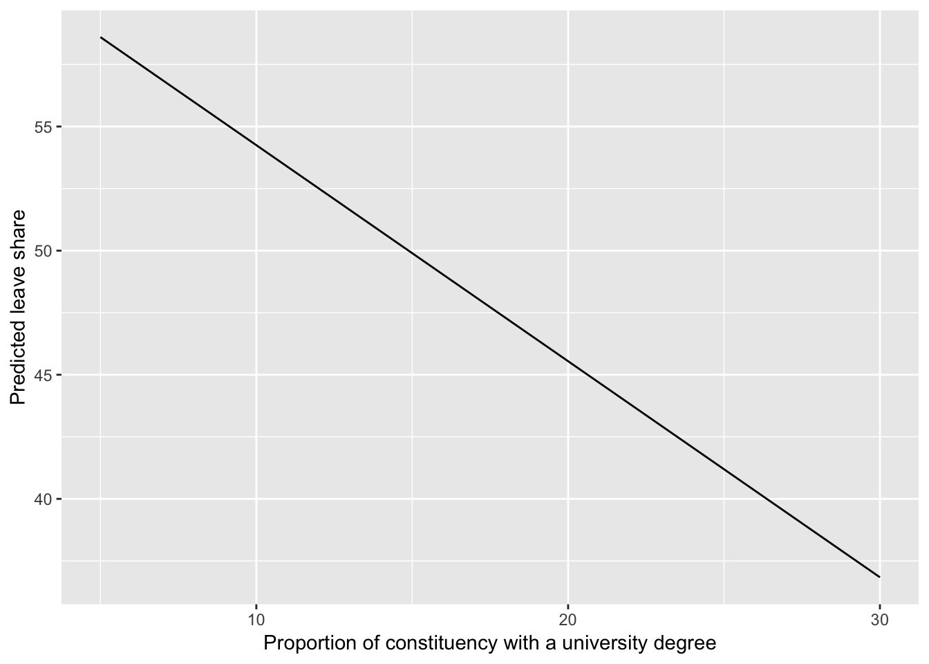
With one final mathy tweak, we can add 95% confidence intervals to this line. We haven’t covered confidence intervals yet, but we will.
model_predictions_with_intervals <- model_predictions %>%
  mutate(conf_low = .fitted + (1.96 * .se.fit),
         conf_high = .fitted - (1.96 * .se.fit))

ggplot(model_predictions_with_intervals, aes(x = degree, y = .fitted)) +
  geom_ribbon(aes(ymin = conf_low, ymax = conf_high), alpha = 0.25) +
  geom_line() +
  labs(y = "Predicted leave share",
       x = "Proportion of constituency with a university degree")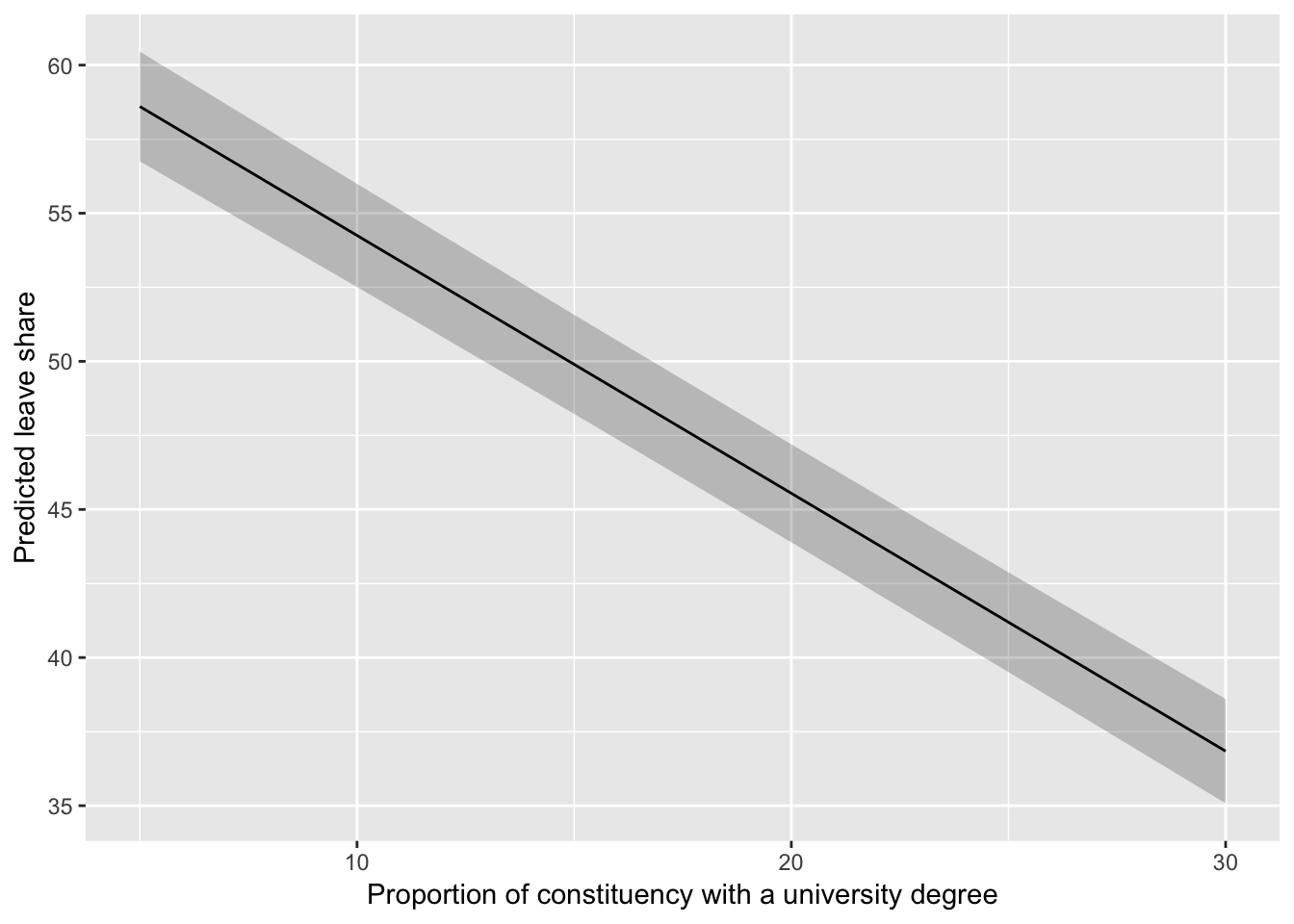
All models side-by-side
Like we did before, we can use huxreg() to view all these models side-by-side and compare the coefficients and the \(R^2\) values:
huxreg(brexit_leave_immigration, leave_educ_age,
leave_politics, leave_everything) | (1) | (2) | (3) | (4) | |
| (Intercept) | 7.98 * | 76.51 *** | 33.10 *** | 56.38 *** |
| (3.12) | (0.56) | (1.24) | (2.64) | |
| born_in_uk | 0.50 *** | -0.05 ** | ||
| (0.04) | (0.02) | |||
| degree | -1.13 *** | -0.87 *** | ||
| (0.02) | (0.03) | |||
| age_18to24 | -0.46 *** | -0.20 *** | ||
| (0.05) | (0.04) | |||
| con_2015 | 0.01 | 0.16 *** | ||
| (0.02) | (0.02) | |||
| lab_2015 | -0.03 | 0.06 *** | ||
| (0.02) | (0.02) | |||
| ukip_2015 | 1.49 *** | 0.71 *** | ||
| (0.04) | (0.04) | |||
| N | 632 | 573 | 632 | 573 |
| R2 | 0.24 | 0.84 | 0.72 | 0.91 |
| logLik | -2348.26 | -1646.56 | -2034.44 | -1471.16 |
| AIC | 4702.52 | 3301.12 | 4078.87 | 2958.32 |
| *** p < 0.001; ** p < 0.01; * p < 0.05. | ||||
Phew. All done!
Clearest and muddiest things
Go to this form and answer these three questions:
- What was the muddiest thing from class today? What are you still wondering about?
- What was the clearest thing from class today?
- What was the most exciting thing you learned?
I’ll compile the questions and send out answers after class.