Correlation and basic regression
Materials for class on Thursday, October 11, 2018
Contents
Slides
Download the slides from today’s lecture:
World happiness
Here we explore the relationship between national happiness and life expectancy. We follow the same pattern outlined in ModernDive and in class:
- Explore the data and plot X and Y
- Draw a line that approximates the relationship between X and Y
- Find the mathy parts of the line
- Interpret the math
I collected this data from the UN and the World Bank. If you’re interested, you can see the R script I used to create this dataset here.
You can follow along if you download this CSV file:
1. Explore the data and plot X and Y
First we load the packages we’ll be using and load the data. Here I assume that the world_happiness.csv file is in a folder named data, but it could be anywhere—adjust the path in read_csv() accordingly.
# Load data and packages
library(tidyverse)
library(moderndive)
library(skimr)
world_happiness <- read_csv("data/world_happiness.csv")This data includes a lot of variables. We can see a quick summary of all of them with the glimpse() function, introduced in your ModernDive reading. There are 11 variables and 217 rows:
glimpse(world_happiness)## Observations: 217
## Variables: 11
## $ iso2c <chr> "AD", "AE", "AF", "AG", "AL", "AM", "AO", …
## $ happiness_score <dbl> NA, 6.901, 3.575, NA, 4.959, 4.350, 4.033,…
## $ happiness_se <dbl> NA, 0.03729, 0.03084, NA, 0.05013, 0.04763…
## $ country <chr> "Andorra", "United Arab Emirates", "Afghan…
## $ year <dbl> 2015, 2015, 2015, 2015, 2015, 2015, 2015, …
## $ school_enrollment <dbl> NA, 93.38943, NA, 78.57764, 95.19960, 92.4…
## $ life_expectancy <dbl> NA, 77.10100, 63.28800, 76.20700, 78.17400…
## $ access_to_electricity <dbl> 100.00000, 100.00000, 71.50000, 96.82629, …
## $ gdp_per_cap <dbl> 41765.9204, 40753.8863, 620.0565, 12771.76…
## $ region <chr> "Europe & Central Asia", "Middle East & No…
## $ income <chr> "High income", "High income", "Low income"…For this example, we care most about happiness_score and life_expectancy. We can find summary statistics for both using the skim() function (also introduced in ModernDive):
world_happiness %>%
  select(happiness_score, life_expectancy) %>%
  skim()
## Skim summary statistics
## n obs: 217
## n variables: 2
##
## ── Variable type:numeric ───────────────────────────────────────────────────────────────────────────────────
## variable missing complete n mean sd p0 p25 p50 p75
## happiness_score 62 155 217 5.37 1.15 2.84 4.52 5.21 6.22
## life_expectancy 19 198 217 72.07 7.88 51.41 66.5 74.19 77.42
## p100 hist
## 7.59 ▁▃▆▇▅▆▅▃
## 84.28 ▁▂▃▃▅▇▆▆We can learn a lot just from this table. The smallest value of happiness (p0) is 2.84, while the highest (p100) is 7.59, while the average is 5.37. Life expectancy ranges from 51.41 to 84.28, with an average of 72.07. The histogram column shows the distribution of each variable.
We can also find the correlation between these two variables, which shows how closely the two are related, and in which direction. HOWEVER, using the fancy get_correlation() function won’t work because there are missing values, and as we learned with calculating means and sums, R doesn’t know what to do when it encounters missing values, so it just returns NA
# so sad
world_happiness %>%
  get_correlation(happiness_score ~ life_expectancy)
## # A tibble: 1 x 1
## correlation
## <dbl>
## 1 NAThere are two ways to fix this. First, we can filter out all the rows where happiness or life expectancy is missing, and then use get_correlation(). The is.na() function determines if something is missing. Negating it with ! like !is.na() means “check if the value is not missing”.
world_happiness %>%
  filter(!is.na(happiness_score), !is.na(life_expectancy)) %>%
  get_correlation(happiness_score ~ life_expectancy)
## # A tibble: 1 x 1
## correlation
## <dbl>
## 1 0.743Alternatively, you can not use the get_correlation() function and instead use cor(), which is R’s actual function for finding correlation. If you look at the help file for cor(), you’ll see that there’s an argument that tells R what to do with missing data, similar to the na.rm = TRUE concept that we saw with mean() and sum(). By default, cor() will use all rows from both of the variables you’re correlating, which means it chokes when there is missing data. Instead of using everything, you can use only the rows with complete observations (i.e. where there’s data for both happiness and life expectancy). Here’s how you use the use argument to tell R to only look at complete rows:
world_happiness %>%
  summarize(happy_life_correlation = cor(happiness_score, life_expectancy,
                                         use = "complete.obs"))
## # A tibble: 1 x 1
## happy_life_correlation
## <dbl>
## 1 0.743Phew. Back to interpretation now. The correlation coefficient for national happiness and life expectancy is 0.743. With that, you can write the following sentences, using the template we talked about in class:
National happiness and life expectancy are positively and strongly correlated. As life expectancy increases, happiness also tends to improve (r = 0.743).
Finally, let’s make a scatterplot of the two variables (it will warn you that it couldn’t plot some of the points—that’s fine. We knew from looking at the skim table above that some of these countries have missing data):
ggplot(world_happiness, aes(x = life_expectancy, y = happiness_score)) +
  geom_point()
## Warning: Removed 62 rows containing missing values (geom_point).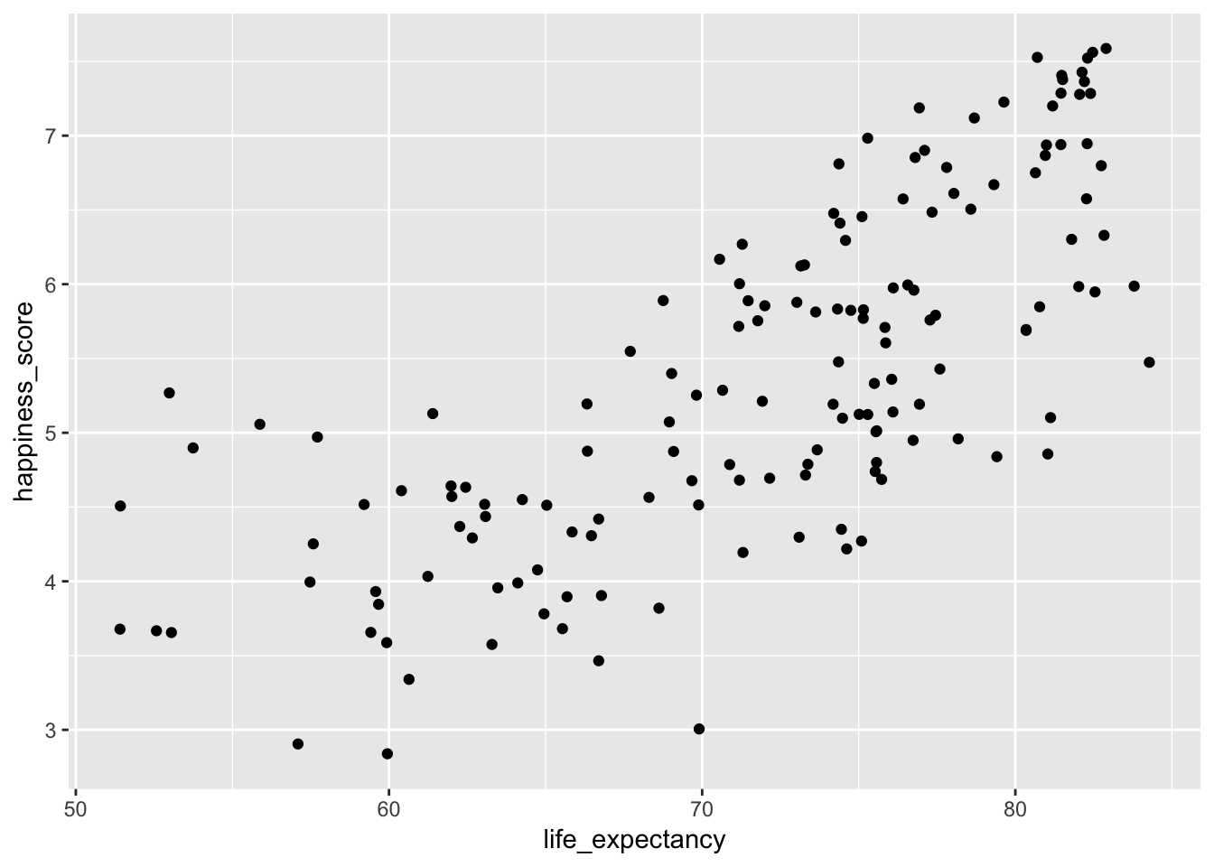
That looks like a good positive relationship!
2. Draw a line that approximates the relationship between X and Y
Next, we want to draw a straight line that captures the relationship between the two. As we discussed in class (and as you read in ModernDive), the line should minimize the (squared) distance between each point and the line. R does this for you—you’ll never have to do this by hand. Use geom_smooth(method = "lm") to add a straight line.
ggplot(world_happiness, aes(x = life_expectancy, y = happiness_score)) +
  geom_point() +
  geom_smooth(method = "lm")
## Warning: Removed 62 rows containing non-finite values (stat_smooth).## Warning: Removed 62 rows containing missing values (geom_point).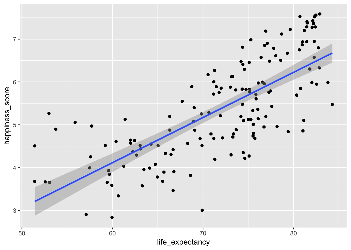
3. Find the mathy parts of the line
Next, we need to find the slope and y-intercept of this line. Remember that we can define any line mathematically with the equation
\[ y = mx + b \]
or
\[ y = b + mx \]
where \(m\) is the slope (\(\frac{\text{rise}}{\text{run}}\)), and \(b\) is the point where the line crosses the y-axis.
In stats terminology, we write this equation with betas instead of \(m\) and \(b\):
\[ \hat{y} = \beta_0 + \beta_1x_1 + \epsilon \]
where \(\beta_0\) is the y-intercept and \(\beta_1\) is the slope.
We can calculate these coefficients with the lm() function (or linear model). We feed the function two things: a formula and a data frame. The formula follows the pattern y ~ x (or in English, “y is explained by x”). In this situation, happiness is our outcome variable and life expectancy is our explanatory variable, so the formula would be happiness_score ~ life_expectancy (or “happiness is explained by life expectancy”). Here I name the model model1, but that’s just a name I made up. You can call it anything (happy_life_model maybe):
model1 <- lm(happiness_score ~ life_expectancy, data = world_happiness)We can see the full model details with the get_regression_table() function:
model1 %>%
  get_regression_table()
## # A tibble: 2 x 7
## term estimate std_error statistic p_value lower_ci upper_ci
## <chr> <dbl> <dbl> <dbl> <dbl> <dbl> <dbl>
## 1 intercept -2.22 0.556 -3.98 0 -3.31 -1.12
## 2 life_expectancy 0.105 0.008 13.7 0 0.09 0.121We now have an intercept or \(\beta_0\) (-2.22) and a slope or \(\beta_1\) (0.105), which means we can write the full equation for this line:
\[ \hat{\text{happiness}} = -2.22 + 0.105 \times \text{life expectancy} + \epsilon \]
4. Interpret the math
Finally, we can interpet what these betas (or coefficients) actually mean. Remember that for now, all we care about are the term and estimate columns—we’ll cover what the other columns are later:
model1 %>%
  get_regression_table()
## # A tibble: 2 x 7
## term estimate std_error statistic p_value lower_ci upper_ci
## <chr> <dbl> <dbl> <dbl> <dbl> <dbl> <dbl>
## 1 intercept -2.22 0.556 -3.98 0 -3.31 -1.12
## 2 life_expectancy 0.105 0.008 13.7 0 0.09 0.121The intercept of -2.22 means that this line crosses the y-axis at -2.22. It doesn’t look like this in the graph, though. There it looks like it crosses at 3ish. That’s because the graph is zoomed in and the x-axis starts at 50. If we zoom out and include 0 in the x-axis, we can see that the actual y-intercept is really just below -2.
ggplot(world_happiness, aes(x = life_expectancy, y = happiness_score)) +
  geom_point() +
  # fullrange = TRUE means that the line will go beyond the points
  geom_smooth(method = "lm", fullrange = TRUE) +
  # This forces the x axis to include 0
  expand_limits(x = 0)
## Warning: Removed 62 rows containing non-finite values (stat_smooth).## Warning: Removed 62 rows containing missing values (geom_point).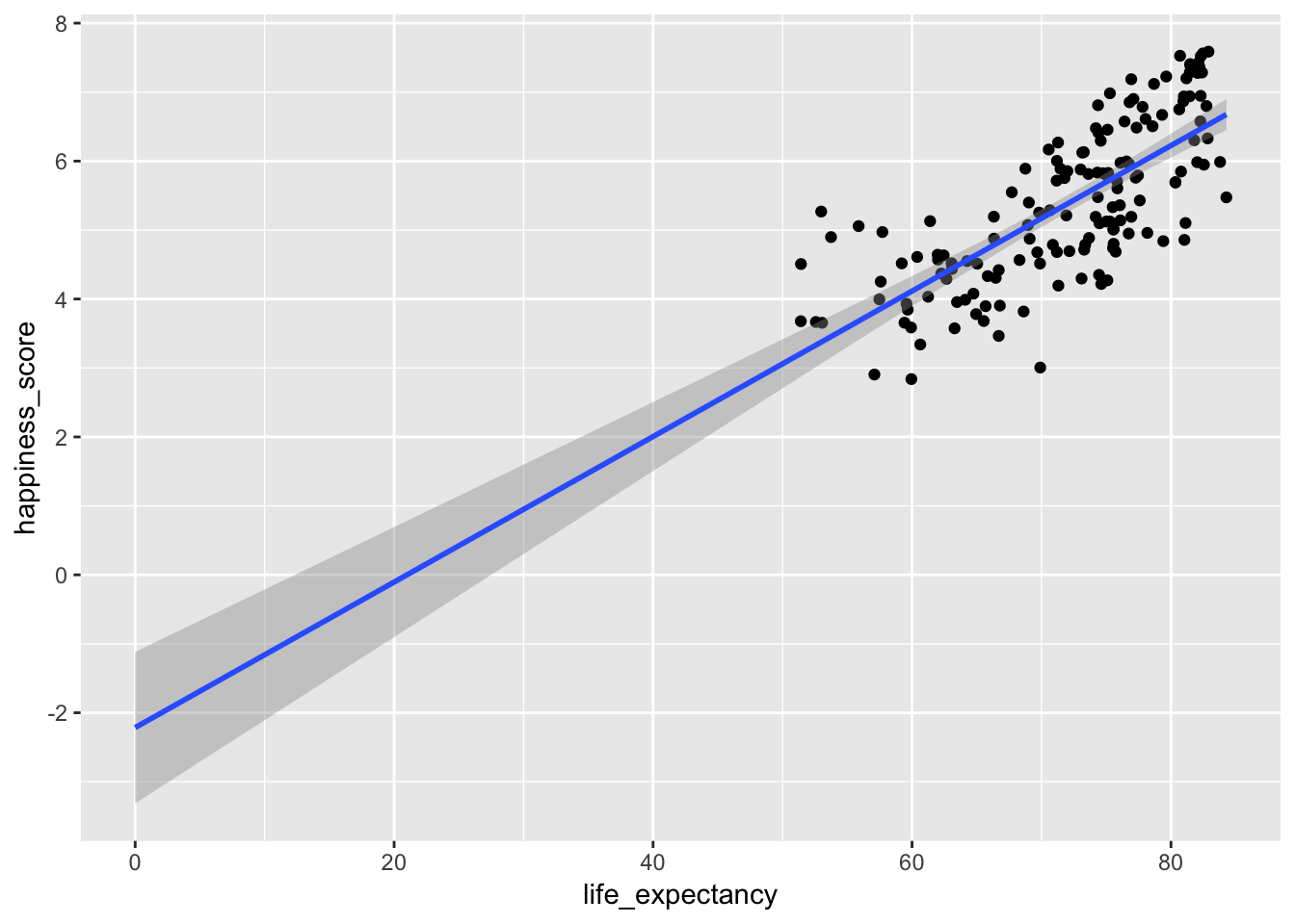
In this case, because there aren’t any countries with life expectancies of zero, the actual value of the intercept isn’t that important. Technically it means that a country with a life expectancy of zero would have an average associated happiness level of -2.22. But that’s non-sensical.
What is important, though, is the value of the \(\beta_1\) coefficient, or the slope of life expectancy. This tells us that for every unit increase in life expectancy, there’s an associated increase in happiness of 0.105. If life expectancy increase by 10 years, we could predict an associated increase in happiness of 1.05 points, on average. Neat!
We can use the following template to interpret this coefficient:
A one unit increase in life expectancy is associated with a 0.105 point increase in happiness, on average.
Don’t succumb to the temptation to tell a causal story, though. Life expectancy doesn’t necessarily cause happiness. The reverse story is just as plausible (as life expectancy increases, happiness will increases). There’s no mathematical or statistical way to test for causation though—it’s all a question of theory and philosophy.
And that’s it! We’ve run a regression model and interpreted the results.
Here’s what this would all look like in an actual policy report or academic paper:
Final wording for a report
Does living longer make you happier? Using data from the World Bank and UN, we examined the relationship between life expectancy and national happiness. As seen in Figure 1 below, the two measures are strongly and positively correlated—as life expectancy increases, happiness also tends to improve (r = 0.743). Table 1 provides the results from an OLS regression model, with happiness as the outcome variable. The model shows that a one year increase in life expectancy is associated with a 0.105 point increase in national happiness, on average.
This is most assuredly not decisive evidence that longer life leads to greater happiness, though. The mechanisms that cause better life expectancy (better access to healthcare, political stability, absence of violence, better access to food, etc.) also all probably improve national happiness. Moreover, there is a plausible story of reverse causality—greater happiness might make you live longer. Regardless, we can see that there is a positive relationship between the two and that on average, countries that make improvements to life expectancy can expect greater national happiness.
# Tweak the graph a little to make it more publication-worthy
#
# In a real, real-life report you wouldn't want to include this code. You can
# make it so it doesn't show in the knitted document by adding `echo=FALSE` to
# the chunk options.
ggplot(world_happiness, aes(x = life_expectancy, y = happiness_score)) +
  geom_point() +
  geom_smooth(method = "lm") +
  labs(x = "Life expectancy", y = "National happiness",
       title = "Figure 1: Relationship between life expectancy and national happiness",
       caption = "Source: UN World Happiness Report and World Bank Development Indicators") +
  theme_minimal()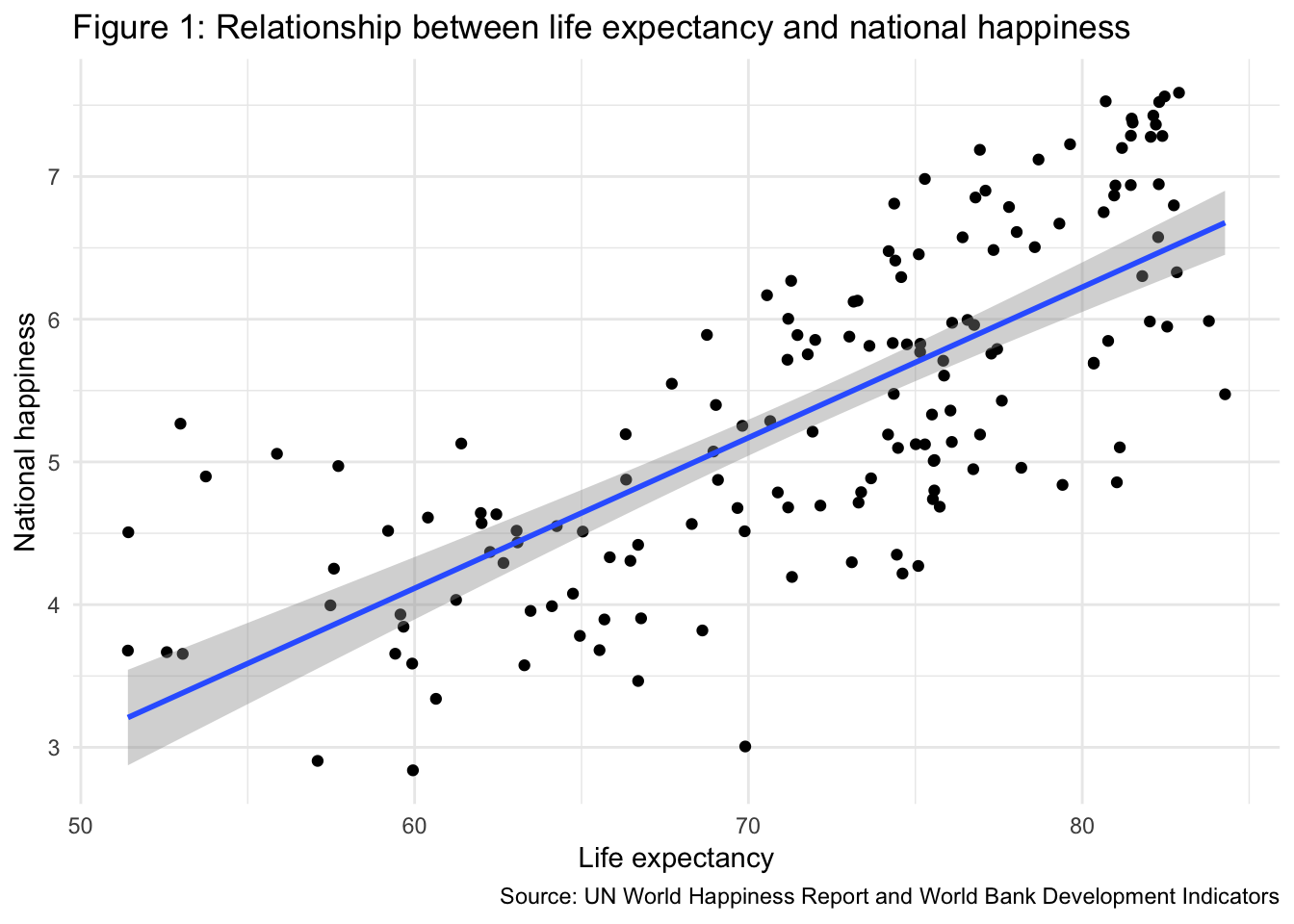
| term | estimate | std_error | statistic | p_value | lower_ci | upper_ci |
|---|---|---|---|---|---|---|
| intercept | -2.215 | 0.556 | -3.983 | 0 | -3.313 | -1.116 |
| life_expectancy | 0.105 | 0.008 | 13.73 | 0 | 0.09 | 0.121 |
Clearest and muddiest things
Go to this form and answer these three questions:
- What was the muddiest thing from class today? What are you still wondering about?
- What was the clearest thing from class today?
- What was the most exciting thing you learned?
I’ll compile the questions and send out answers after class.